4 Unit 4
4.1 Transportation Systems
Learning Objectives
At the end of this unit, students should be able to:
-
Use Vehicle fuel efficiency to calculate gallons of fuel, miles driven, or energy inputs
-
Calculate vehicle carbon dioxide emissions from fuel sources based on carbon emissions coefficients
-
Compare and contrast transportation fuel mass and volume densities and their implications
-
Explain opportunities and limitations for batteries in the transportation sector
-
Discuss issues and limitations with transportation infrastructure and public transportation
-
Provide and discuss examples of transportation system triple bottom line issues including environmental issues, payback time, last-mile issues, and environmental justice
4.1.0.1 Additional Resources
University of Michigan Factsheets - an online source that’s updated yearly for sustainabilty referenced information. Within transportation, explicitely look at personal transportationand electric vehicles. For the personal transportation, is the factsheet car-centric? Are there other optoins? These factsheets are updated annually.
4.1.1 Introduction
This module is centered on the topic of Transportation Systems. We all use a variety of forms of Transportation in our everyday lives, and like energy, tend to take the ability to move around locally and globally for granted. We will discuss issues of efficiency, fuels, emissions and environmental impacts for various transportation vehicles/modes. We will also spend some time discussing the engineering tradeoffs for various transportation systems as well as Triple Bottom Line issues associated with transportation systems.
4.1.2 Transportation System Energy
As we have seen from the energy flow diagrams in previous chapters and Figure 4.1, the Transportation sector accounted for 27% of US primary energy in 2022 with approximately 90% coming from petroleum, approximately 5% from natural gas and renewables (biofuels), and less than 1% from electricity (rounding errors account for these values adding to over 100%).
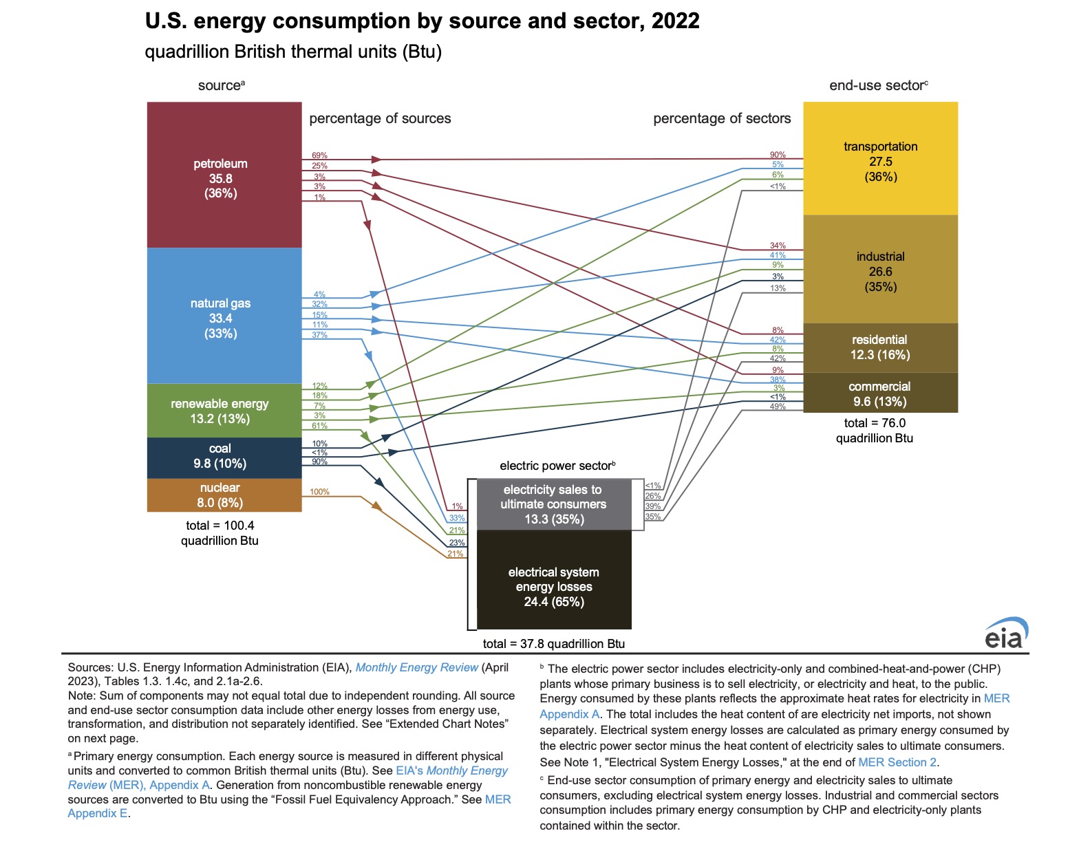
Figure 4.1: US energy consumption by source and sector. Source: https://www.eia.gov/energyexplained/us-energy-facts/
In the US, this means that more than 375 million gallon of gasoline are used every day. Numbers this big are hard to put into context, so it’s always a good idea to try to relate statistics and data to more understandable units. An Olympic swimming pool holds 660,000 gallons of water, so US gasoline usage is 560 swimming pools of gasoline per day!
Figure 4.2 breaks down the transportation fuels in more detail. Gasoline is the dominant fuel followed by diesel, which is called distillates in this data set. Distillate fuels are used mainly by trucks, buses, trains, and some boats and ships.
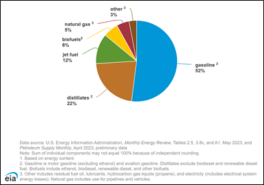
Figure 4.2: US Transportation Energy Sources (2022). Source: https://www.eia.gov/energyexplained/use-of-energy/transportation.php
The energy flow diagram in Figure 4.1 that we have used often in this text also breaks down transportation sector energy by source with almost 90% from petroleum and less than 1% from electricity. Recall that the renewable energy in the transportation sector is mainly bioethanol and biodiesel.
These percentages are poised to shift as this sector transitions to more hybrid and electric vehicles. Electric and hybrid vehicle sales have increased steadily in the US since 2020 with hybrid and electric vehicle sales in the 7 – 8% range of total vehicle sales and plug-in hybrid sales around 2%. (reference: EIA - https://www.eia.gov/todayinenergy/detail.php?id=62063).
There are many different types of transportation systems which include the movement of both people and goods. Figure 4.3 show the breakdown of energy consumption in the US for a number of these different modes in units of gallons of gasoline equivalent (GGE). This strange-sounding metric is necessary to put all of the transportation modes on the same comparative scale since they use different types of fuels. For gasoline-powered vehicles, GGE is simply the number of gallons used. For all other fuels, GGE is determined by calculating the total energy in the fuel divided by the volumetric energy density of gasoline (equation (4.1)).
\[\begin{equation} GGE=\frac{E_{fuel}}{\rho_{gas}} \tag{4.1} \end{equation}\]
and
\[\rho_{gas}=115,000 \frac{BTU}{gallon}\]
The data in Figure 4.3 is the total amount of energy consumed which is a combination of the fuel efficiency of the system and the scale of transportation. Light duty vehicles, mostly passenger cars, dominate fuel energy due to the total number of these vehicles being used every day. This is a key point since many individuals don’t consider personal vehicles and individual driving choices as a major sustainability issue given their relatively smaller size compared to semi-tractor trucks, cargo ships, trains, and airplanes. It is the scale of personal vehicle use that makes this category use so much more energy, and in turn, have the related environmental impacts. Pipelines are included in this graph since they transport large amounts of natural gas for our energy and economy. Natural gas, itself, is the primary energy input to operate the compressors that push the gas through the pipelines.
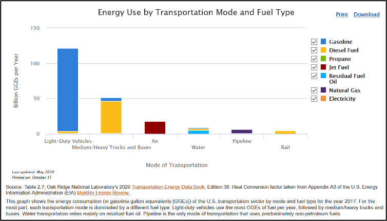
Figure 4.3: – US Energy Use by Transportation Mode and Fuel Type (2017)
Figure 4.4 breaks down the transportation modes in more detail by percentages compared to the totals in the previous graph. Light trucks, typically the ubiquitous sport utility vehicles (SUVs), that dominate car sales have the highest energy use following by smaller cars and then larger trucks.
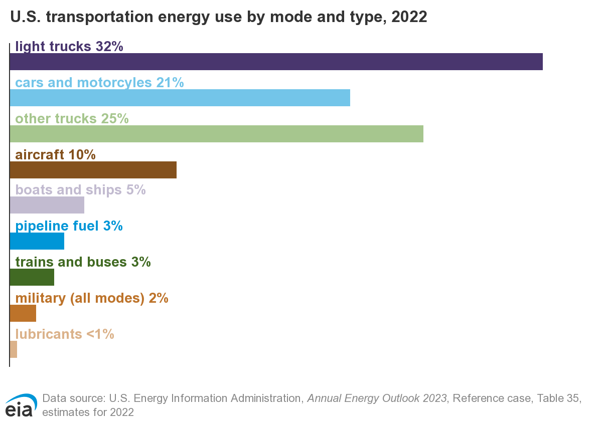
Figure 4.4: US Transportation Energy Use By Mode and Fuel Type (2022)
These previous graphs are useful but give limited useful information regarding the energy intensity for passenger transportation. This metric is the energy per passenger and is critical for comparing modes that transport widely different numbers of people. In Figure 4.5, it is seen that the average number of passengers drives this figure or merit and challenges some assumptions about the environmental impacts of some modes of transport. For example, transit buses are generally promoted as good options in cities for reducing environmental impacts. This is true for places like large cities or universities with highly used bus systems. However, many bus systems do not carry full passenger loads most of the time, on average only 7.7 passengers, and this makes the energy intensity in these cases worse than both cars and personal trucks. Despite this poor energy intensity, we will discuss later the triple bottom line factors that make bus systems critical in many locations.
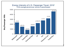
Figure 4.5: US Passenger Travel Energy Intensity (2019). Source: Center for Sustainable Systems, University of Michigan. 2022, Pub. No. CSS01-07
Conventional cars and trucks use internal combustion engines (ICEs) and have a number of inefficiencies related to the complexity of these mechanical systems. These energy losses are summarized in Figure 4.6. Most ICEs have an efficiency of approximately 40% meaning they are only a little more efficient than a steam-turbine power plant. Due to other losses in the drivetrain, tires, and accessories, only 16%–25% of the energy from the fuel you put in a conventional vehicle actually moves the vehicle down the road, and this value depends on a variety of vehicle features. Since ICE vehicles have been around for 100 years, many of the systems in the car have been optimized so significant improvements are difficult. As was the case with efficiencies in other power systems that we have discussed in earlier chapter, the overall efficiency for a vehicle is the product of the individual efficiencies (equation (4.2):
\[\begin{equation} \varepsilon_{total} = \varepsilon_{engine} \times \varepsilon_{transmission} \times \varepsilon_{aerodynamics} \times \varepsilon_{accessories} \times \varepsilon_{tires}... \tag{4.2} \end{equation}\]
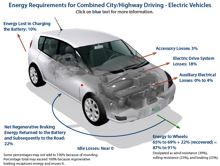
Figure 4.6: Energy Losses For Gasoline Vehicles. Source: https://www.fueleconomy.gov/feg/atv.shtml
Despite these inefficiencies for ICE vehicles, they still dominate the marketplace for a couple of reasons. First, the energy density for liquid fuels is very high as seen in Figure 4.7 which plots volumetric energy density vs. gravimetric energy density for different energy sources. Volumetric energy density is the energy in the fuel divided by its volume which is appropriate for vehicles with a fixed fuel tank size (equation (4.3). The higher the volumetric fuel density, the smaller the fuel tank can be for the same amount of energy (equation (??)). Gravimetric energy density is the energy in the fuel divided by the fuel mass which is important since the weight of the fuel must be carried by the vehicle as well.
\[\begin{equation} \rho_{volumetric}=\frac{E_{fuel}}{V_{fuel}} \tag{4.3} \end{equation}\]
\[\begin{equation} \rho_{gravimetric}=\frac{E_{fuel}}{m_{fuel}} \end{equation}\]
For natural gas and hydrogen, this plot shows these fuels for both the gas and compressed (liquid) forms. As gaseous fuels are compressed, the volumetric fuel density increases while the gravimetric fuel density stays constant. High pressures can compress gas to a liquid state. This explains why natural gas is more efficiently shipped overseas as liquid natural gas (LNG) since pipelines aren’t available across the ocean and the ship cargo volume is fixed. The tradeoff in this case is that it takes energy to compress natural gas to a liquid and to cool it to hold it in this phase. Another example is hydrogen, which is being considered as an advanced transportation fuel. The gravimetric density of hydrogen is higher than all other fuels since this molecule is so light. However, the volumetric density is too low for practical use since massive hydrogen tanks would be necessary. Therefore, large scale implementation of hydrogen would require high pressure or liquid hydrogen for feasibility.
Ethanol and Biodiesel as seen in the energy density plot to have both lower volumetric and gravimetic energy density. This means that for the same fuel tank, less energy is available with these biofuels and fewer miles can be driven.
You may notice and wonder about the energy density of lithium batteries in the bottom left-hand corner of this plot. We will come back to this significant disadvantage in our discussion on electric vehicles (EVs), but low energy densities limit total range (miles) and are a major reason why liquid fuels have dominated our transportation system over the last century.
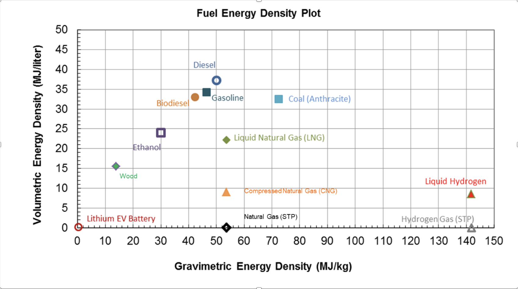
Figure 4.7: Fuel Energy Density Plot
SEAN EDITING STOP 10/24/24
4.1.2.1 Fuel Economy
Fuel economy is defined as the distance a vehicle travels divided by the amount of fuel used as shown in equation (4.4). For liquid fossil fuels, the units for fuel economy are miles/gallon, or simplified, mpg.
\[\begin{equation} fuel\;economy=\frac{miles\;traveled}{fuel\;used} \tag{4.4} \end{equation}\]
As the fuel economy of a vehicle increases, the emissions/mile are decreased because the vehicle travels more miles for the same volume of fuel. This metric is just another way of characterizing the efficiency, Eout/Ein, of a vehicle. Miles traveled are proportional to the energy output of the energy with various losses in the engine, air resistance, tire resistance, etc. The energy input is proportional to the volume of fuel and related by the volumetric energy density – Btu per gallon, for example.
Figure 4.8 shows the average fuel economy over time in the US for different types of vehicles. It is easy to see that there is a range of fuel economy based on the type of vehicle. In recent years, the average of all US passenger vehicles has been approximately 25 mpg based on the mixture of higher fuel economy sedans and lower fuel economy trucks and SUVs. The increases in the graph occur due to technological advances like more efficient engines, better aerodynamics, lighter vehicle frames, etc. There is also a policy component to these increases as the US government has Corporate Average Fuel Economy (CAFE) standards which set limits on the average fuel economy for all vehicles sold by a given manufacturer.
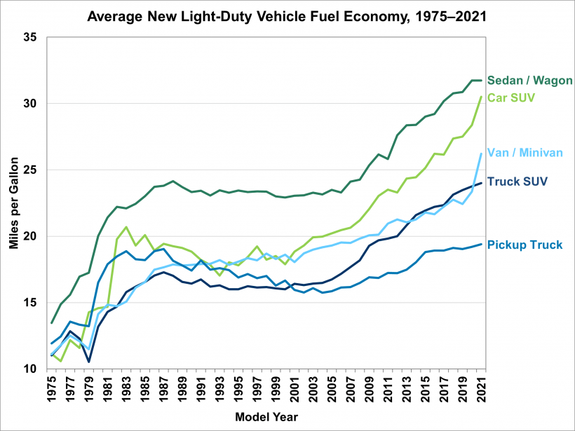
Figure 4.8: Average New Light-Duty Vehicle Fuel Economy (1975 – 2021). Source: EERE Vehicle Technology Office, Fact of The Week 1237, May 9, 2022
Exercise:
For a given number of miles driven in a city, which of the two choices below is better from an energy and environmental perspective, or, are they equivalent? How could you explain this clearly to others?
- Replace the same number of 10 mpg vehicles with 20 mpg vehicles
- Replace the same number of 30 mpg vehicles with 40 mpg vehicles
Once you have done this exercise, you may recognize that Gallons per mile is a more useful metric than miles/gallon since both energy and emissions are directly proportional to gallons and only indirectly proportional to miles.
4.1.3 Electric Vehicles
While electric vehicles seem like a new technology, their history actually goes back much farther. Electric cars were developed and sold in the early 1900s given some initial challenges and drawbacks for gasoline powered vehicles (Figure 4.9 . As seen in Figure 4.x, the Detroit Electric vehicle was sold in the 1920s and used a rechargeable lead acid or nickel-iron battery. This car could travel 80 – 100 miles per charge. As improvements were quickly made with internal combustion engines and prices decreased, sales of this vehicle dropped and they disappeared completely in the marketplace by 1935.
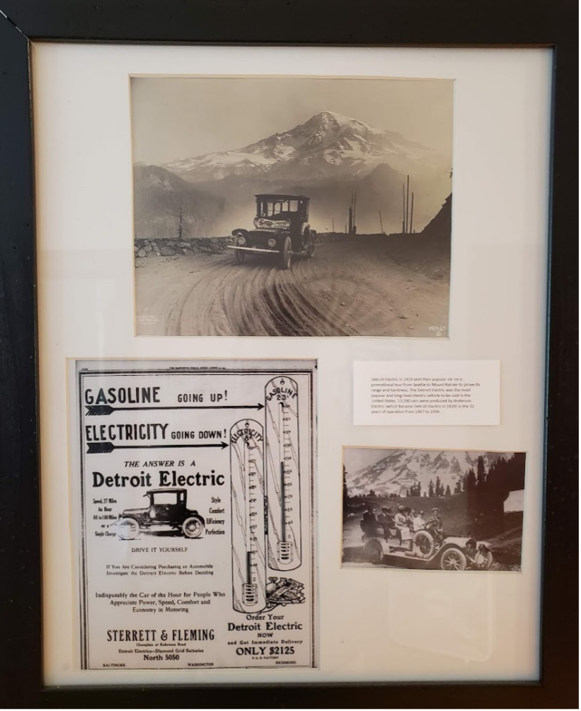
Figure 4.9: Detroit Electric Car. Source: XXX
EVs convert approximately 70% of the electrical energy from the grid to power at the wheels. However, most EVs recapture energy from regenerative braking which can increase the efficiency to 90% depending on the driving conditions.
The Nissan Leaf 2018 battery is detailed in Figure 4.10. The battery consists of 192 of these thin cells. The cells are package in groups of 8 cells into a module and 24 modules make up the battery system.
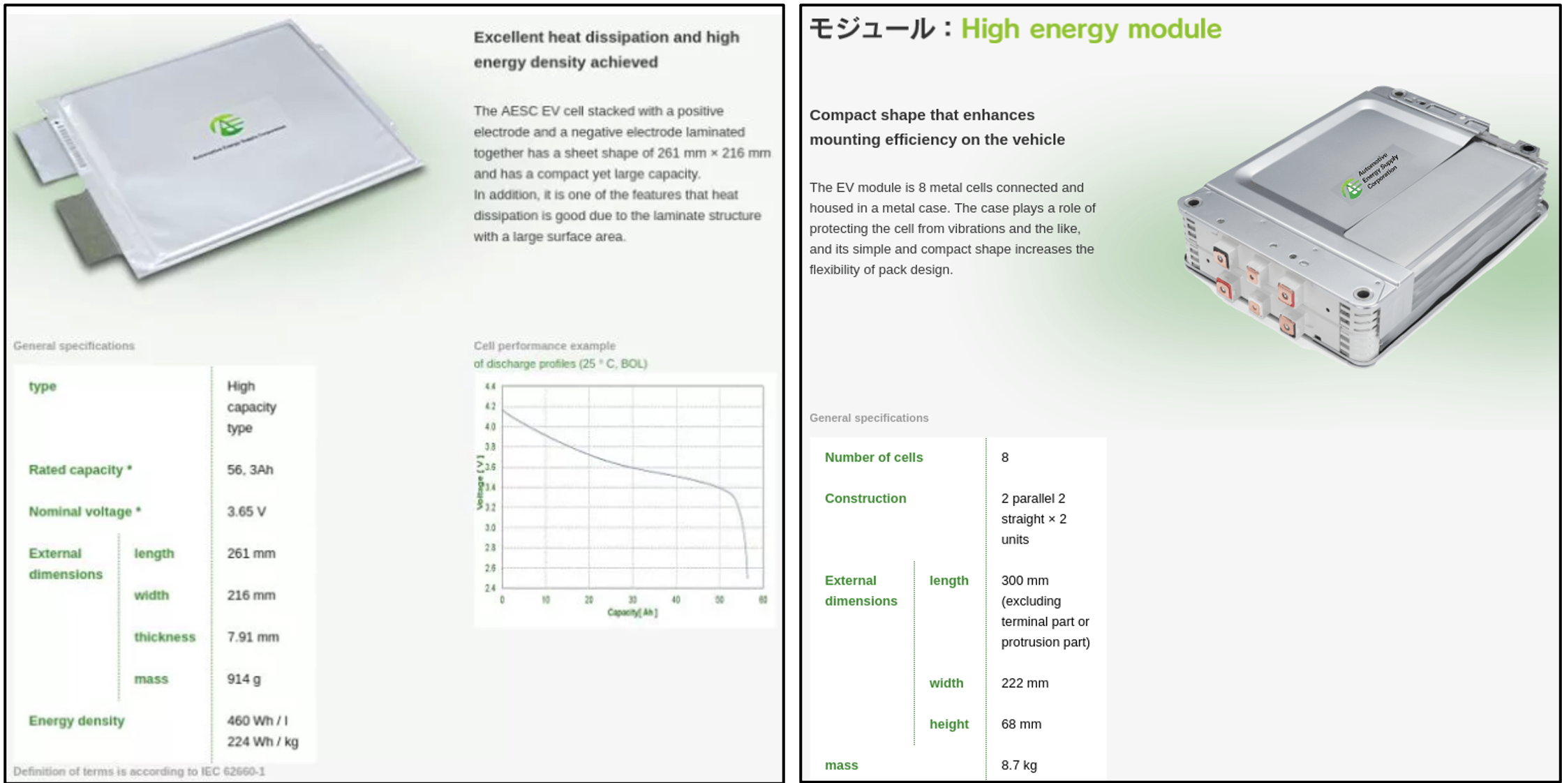
Figure 4.10: Nissan Leaf Battery Specifications from the 2018 model year. Source: https://pushevs.com/2018/01/29/2018-nissan-leaf-battery-real-specs/
Exercise: Estimate the energy density of the Nissan Leaf Lithium Ion Battery Individual Cells:
\[\rho_{g} = (56.3 Ah)(3.65 V)/(0.914 kg) = (225 Wh/kg)(3.6 MJ/1000W) = 0.81 MJ/kg\] \[\rho_{v} = (56.3 Ah)(3.65 V)/(0.000446 m3) = (461 Wh/liter)(3.6 MJ/1000W) = 1.7 MJ/liter\]
Battery Module:
E = (192)(56.3 Ah)(3.65 V) = 39.5 kWh (close to the 40 kWh specification)
g = (39.5 kWh)/(24)(8.7 kg) = 0.68 MJ/kg v = (39.5 kWh)/(24)(0.00453 m3) = 1.3 MJ/liter
Note that the module values are slightly lower since battery module has extra weight and volume when cells are assembled into units. You can see that these values put the lithium ion batteries in the lower lefthand corner of the energy density plot.
Example: A Nissan Leaf 2023 model S can drive approximately 149 miles on a single charge for a 40 kWh rated battery pack. Assume 100% battery efficiency for this exercise and 115,000 Btu/gallon gasoline.
-
What is the vehicle electricity (fuel) cost ($/mile) if electricity costs \(0.12 per kWh?</p></li> <li><p>Compare this to fuel cost (\)/mile) for gasoline vehicle that gets 30 miles/gallon and gas is $3.19/gallon?
-
What are the carbon dioxide emissions (lb CO2/mile) for a typical gasoline car - assume 30 mpg and 20 lbs CO2/gallon for gasoline?
-
What are the carbon dioxide emissions (lb CO2/mile) for this plug-in electric vehicle (PHEV) in Blacksburg if the electricity carbon dioxide emission coefficient is 1.48 lb CO2/kWh.
-
What is the calculated fuel economy in MPGe for the electric vehicle?
EV battery details (figure 4.10) are not the main concern of the typical consumer and driver of a vehicle. The range, which is the distance that a vehicle can travel in a single charge, is a key concern for most drivers. The range of the battery depends on its capacity (size). Unlike power plants, wind turbines, and solar panels, the capacity of a battery for vehicles is given in terms of energy (kWH) not power (kW).
In Figure 4.11, two different Nissan Leaf capacity batteries are shown at 40 kWh and 62 kWh with corresponding ranges of 149 and 226 miles, respectively, on average. This capacity is the nominal amount of electricity that can be stored within the battery. Recall, due to the roundtrip efficiency of all batteries, a slightly more electricity than the nominal capacity is required to charge up the battery and a slightly less can be discharged from the battery to the car.
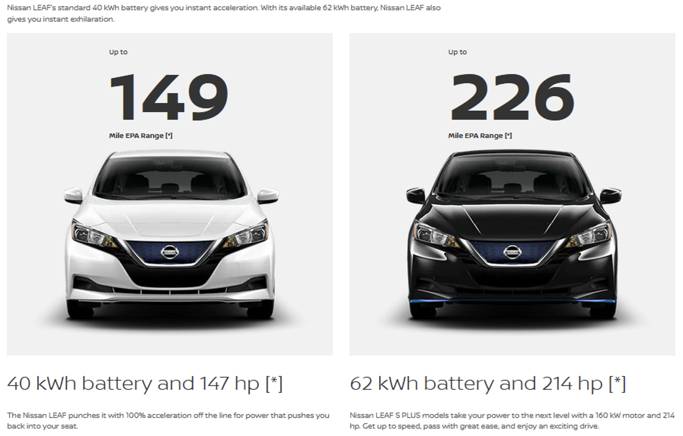
Figure 4.11: Nissan Leaf Battery Specifications from the 2022 model year. Sourec: Nissan
The fuel economy of electric vehicles is most easily understood as the miles traveled per kWh of input energy to the battery. However, this does not allow direct comparison to ICE vehicles with fuel economies in miles per gallon and miles/kWh are not common enough for most consumers to understand and use.
To allow simple comparisons, a conversion factor is used to translate the EV fuel economy into miles per gallon of gasoline equivalent (MPGe). To do this, the energy density of gasoline is used with the battery specifications as shown in the equations below:
\[\begin{equation} EV\;fuel\;efficiency=\frac{miles \; traveled}{fuels \; used}=\frac{battery\;range(miles)}{battery\;capacity(kWh)} \tag{4.4} \end{equation}\]
\[\begin{equation} EV\;fuel\;efficiency\;(MPG_{e})=\frac{battery\;range(miles)}{battery\;capacity(kWh)}\times \frac{115,000 \;BTU/gallon}{3412\;BTU/kWh} \tag{4.5} \end{equation}\]
\[\begin{equation} Nissan\;Leaf\;(MPG_{e} )= \frac{149\;mile}{40\;kWh}\times \frac{115,000\;Btu/gallon}{3412\;Btu/kWh}= 126\;MPG_{e} \tag{4.6} \end{equation}\]
You may prefer just to recall the following conversion factor for 1 kWh in terms of the energy equivalent of gasoline gallons (equation(4.7)):
\[\begin{equation} \frac{115,000BTU/gallon}{3,412BTU/kWh}=33.7\frac{kWh}{GGE} \tag{4.7} \end{equation}\]
EV batteries have a number of issues that affect their performance and can be reasons that people are not ready to change from conventional ICE vehicles. The batteries are a relatively heavy component of a car with an average weight around 1,000 pounds though it will vary by vehicle. This extra weight necessarily increases the energy needed to move the car and reduces efficiency. The weight also additional force between the wheels and road causing the wheels to wear out sooner than for a lighter vehicle.
The cost of EV batteries depends on a number of factors including size, technology, and brand. It is hard to generalize battery costs so a number of battery cost are provided in the Table below. Comparisons are complicated by the fact that higher priced luxury brands often charge more for their batteries.
Examples of a range of EV vehicles available today.
| Model | Battery Type | Battery Capacity | Battery Cost | Total cost of EV |
|---|---|---|---|---|
| 2025 Cadillac Escalade IQ | Nickel Colbalt Magnesese Aluminum | 200 kW | /$22,540 | /$130,000 |
| 2023 Tesla Model S | Nickel Cobalt Aluminum | 100 kW | /\(12,030 | /\)$88,490 | |
| Rivian Delivery Van | Lithium Iron Phosphate | 135 kW | /$13,300 | /$52,690 |
Source : https://www.visualcapitalist.com/visualized-how-much-do-ev-batteries-cost/
Range issues are also diminishing quickly as battery technology improves. That said, this is still a serious issue for the typical consumer who wants to drive just as far with an EV as for an ICE. As consumers, we have become a bit spoiled with a range of 400 miles per tank of gas considering that the average driver in the U.S. drives only 37 miles per day, according to Department of Transportation statistics. This means that a large percentage of trips do require a 400 mile range, yet this is limiting the penetration of EVs in the market. The US Bureau of Transportation Statistics found that more than 90% of trips are less than 25 miles and only approximately 2% of all trips were greater than 50 miles as seen in Figure 4.12. We will come back to this topic in the discussion of Community and the so-called last mile commuting issue.
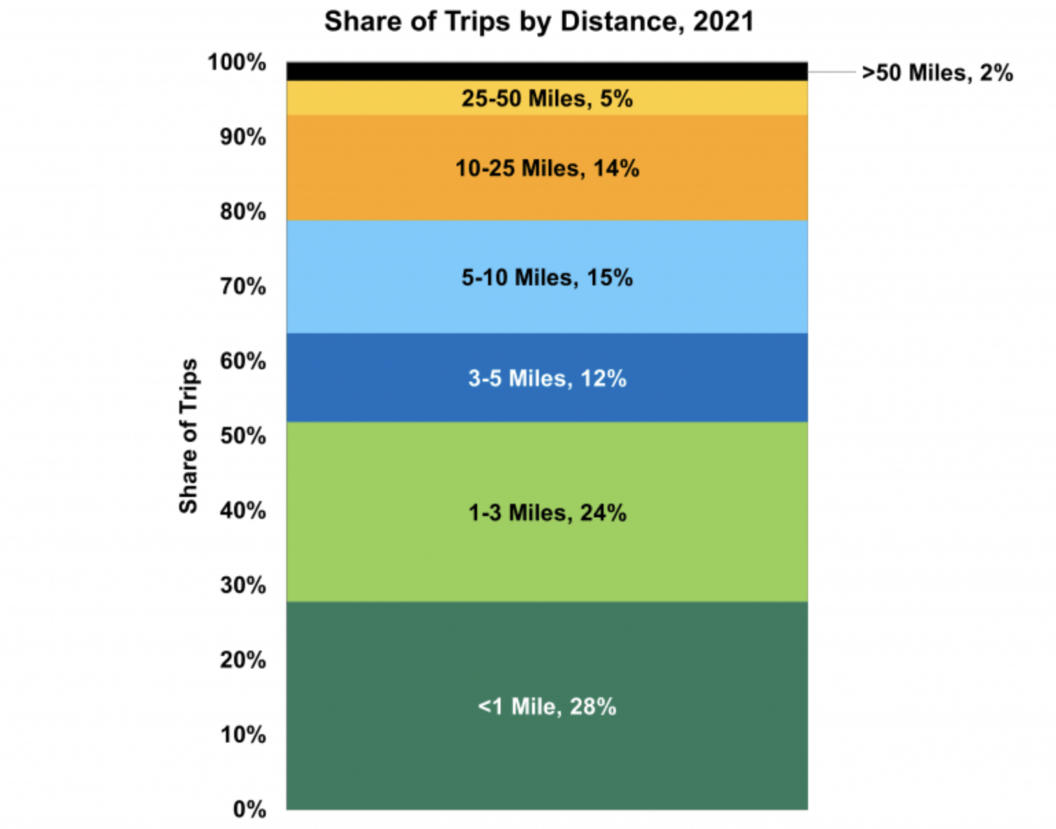
Figure 4.12: Average trips and distance traveled. Sourec: https://www.energy.gov/eere/vehicles/articles/fotw-1230-march-21-2022-more-half-all-daily-trips-were-less-three-miles-2021
Charging time is another large concern for vehicle drivers and a reason noted for reluctance to purchase an EV. Charging time depends directly on the type of charging station. While convenient, it also should be noted that repeated fast charging is thought to reduce the lifetime of EV batteries based on decades of other battery experience, though the research data for the newest battery chemistries is not conclusive on this point.
There are 3 main options for charging which differ mainly in the voltage which determines how quickly electricity can be sent into the battery shown in the images of Figure 4.13. There are different EV connector types depending on the car model, and not all work with all cars.
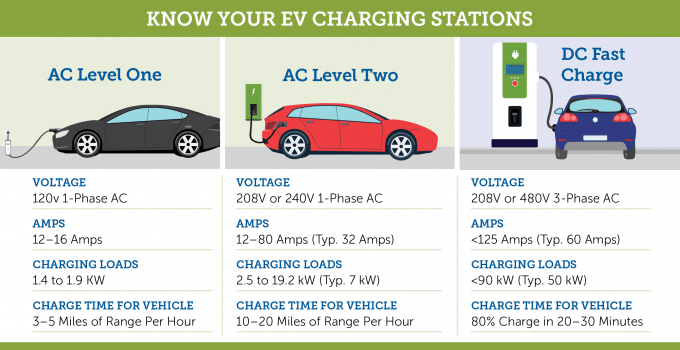
Figure 4.13: EV Charging Options. Source: https://509electric.com/electrical-car-charging-stations-which-one-is-right-for-you/
Level 1 charging is plugging into a regular 120-volt outlet at your house. This is the slowest type of charging and will take more than a day for a full EV battery. The rate of charging is on the order of 2 – 5 miles/hour of charging. For a plug-in hybrid (PHEV), which we will discuss in more detail below, you can charge the battery fully overnight for 20 – 30 mile range. Since this charging is at home, the cost is your utility rate which is between /$0.10 - /$0.20/kWh in US states, except for Alaska and Hawaii which are more.
Level 2 is charging from a 220-volt outlet which is the same type as a household heavy-duty appliance like a washing machine. At level 2, a full EV battery will charge in 4 – 10 hours (overnight). The rate of charging is on the order of 10 - 20 miles/hour of charging. Public Level 2 charging stations are also common at locations where drivers tend to park, like workplaces or commercial parking lots. Level 2 charging depends on the company and location, but approximately /$0.20 - /$0.25/kWh. A special charging system is required at a residential location and this will cost on the order of /$1,000- /$1,500 installed. Some federal tax incentives can cover at least a portion of the cost of Level 2 equipment. Some utilities also give EV charging discounts if you charge during overnight low demand hours.
Level 3 charging is the fastest charging speed and use direct current instead of the AC current for Level 1 and 2 chargers. These are also known as DCFC chargers or direct current fast chargers. In some cases, you can charge to more than 80% in as little as 20 minutes. The charging rate is 180 – 240 miles/hours. For this time convenience, these public charging stations are more expensive to use. Level 3 charging again depends on the company and location, but approximately /$0.40 - /$0.60/kWh. This means that a full charge for a 60 kWh battery is on the order of $30 which is a little cheaper than a gasoline full tank, but 2 – 3 times more expensive than charging at home. Level 3 chargers are getting faster with time; the first-generation Level 3 typically charged vehicles at 50kW, but now some are charging at 350kW.
Both range and charging time are developing at a rapid rate as EV penetration and commitment from major auto companies increases. New advances and chemistries are being developed quickly with product upgrade and projections increasing. Toyota, as just one example, has announced in 2023 a new battery technology in development for 2027- 28 with a range of 600 miles and charging time of 10 minutes for 10 – 80% charge.
Electric vehicle battery fires are another issue of concern, but the scale of the problem is somewhat misleading based on news reporting. While thousands of vehicles of several different leading brands (BMW, Ford, Hyundai, etc) have been recalled, this is based on only dozens of fires. Fires are a serious issue and lithium is a particularly difficult metal to extinguish when it catches fire. Thermal run-aways in lithium-ion batteries in computers and other consumer products have been a minor issue for years and the size of the battery in EVs makes the problem larger. New data suggests that the percentage of fires in ICE vehicles is actually higher in the US than for EVs, but new technologies often get more scrutiny from consumers and legislators.
The battery industry says that challenges car companies face are similar to those experienced by Sony Corp., Boeing Co. and others that have had setbacks with lithium-ion batteries in products. Eventually, the kinks were worked out, and the technology has since become a dominant power source.
The environmental issues associated with batteries are well-known since these convenient energy sources are ubiquitous in society’s products. More focus on battery environmental impacts, however, is warranted due to the scale at which these batteries are projected in near future years based on EV implementation. Lithium-ion batteries have the primary concerns in the environmental and social impacts of the lithium and cobalt life cycles.
Lithium and cobalt have some of the same environmental impacts as the mining of other salts and metals. Ecosystem damage, water pollution, and the use of fossil fuel energy are not new for these materials. Lithium is not a rare material, but the projected scale for lithium-ion batteries is expected to sky-rocket as EV sales increase. Cobalt is not as common and a big issue are societal effects from cobalt mining in the Congo which currently supplies 60 – 70% of the supply of cobalt. Child labor, extremely low wages, lack of environmental regulations, unsafe mining conditions, and the violence in this country are not considered sustainable.
Battery recycling technologies have an opportunity to help at the end of life for batteries, but like many new technologies, the end of life issues and technology often trails the product by some years. In the Rethinking Energy Chapter, we saw that some used vehicle batteries were being connected and used for grid energy storage since the charge and discharge cycles were not a critical for peak-shaving applications. Other companies are quickly trying to develop processes to efficiently and safely disassemble used batteries into raw materials that could be used again in new batteries.
4.1.4 Hybrid Vehicles
As the name implies, hybrid vehicles have components of both conventional internal combustion engines (ICE) and electric batteries. These can either be gasoline only with the battery capturing energy from braking or plug-in hybrid (PHEV) with a much much smaller battery on the size of 10 kWh but capable of 20 – 40 miles. In the short term, hybrid vehicles minimize several issues of concern to buyers and for the environment.
With regard to range, a hybrid has a battery and a gas engine so its range is similar to an ICE and sometimes even a bit higher. Hybrids also eliminate the issue of charging anxiety. With the ICE as a backup, finding a charger on longer trips or in rural areas with fewer charging options is not an issue at all since the ICE can be used. Any charging that can be done for a longer trip is a bonus.
Third, Toyota has been a strong proponent of hybrid vehicles with its Prius one of the first and highest selling models in this category. As other manufacturers have moved strongly toward full EV vehicles, Toyota has still been pushing hybrids to can result in more fuel efficient vehicles on the market quickly. Hybrids not only minimize the issues mentioned above, but the price differential is not as high as for an EV. Given the additional mining and environmental issues with lithium and cobalt, Toyota makes the argument in Figure 4.14 that hybrid gasoline vehicles like the Prius can save more overall carbon emissions due to many more of these cars on the road than the equivalent battery materials for PHEV and full EVs. One thing to remember here is that Toyota, like any car company, is in the business of selling cars.

Figure 4.14: Toyotas marketing approach for their PHEV push. Only time will tell if Toyota loses market share, or their decision pays off. Source: Toyota
A significant opportunity for vehicles going forward in terms of efficiency is light-weighting. Every gram of mass in the vehicle requires energy to push forward. This key concept was known to the earliest of auto manufacturers as given by this quote from Henry Ford:
“I had been experimenting principally upon the cutting down of weight. Excess weight kills any self-propelled vehicle. Weight may be desirable in a steam roller but nowhere else. The most beautiful things in the world as those from which all excess weight has been eliminated. Whenever anyone suggests to me that I might increase weight or add a part, I look into decreasing weight and eliminating a part.”
from “My Life and Work”, Henry Ford
New lightweight aluminum frames and carbon fiber composite panels are being introduced to many vehicles to reduce weight, increase fuel efficiency and performance, and maximize safety for both passengers and people outside of car.
Autonomous Vehicles are not discussed in this text, but we acknolwedge that this techology will also a game changer for mobility. There are many of us that have a car sitting idle in the driveway or parking lot a large portion of the week. Will automonous vehicles make ride-sharing/car renting more likely? Will it make driving on highways safer and more fuel efficient? Will it empower the aging population? Or will they just increase the vehicle miles travelled, or VMT? These are all questions that I don’t have answers for, but what I do know is that I imagine we may all be using automonous vehicles in some form or fashion in the next decade. When I was little, a learned how to drive on a standard transmission. Today, few cars on the market are sold with a manual transmission in the US. Ten years from now, who knows what it will look like.
There are so many questions with how these cars will be programmed - can we save energy? Maximize distributed energy storage? Prioritize passenger safety or pedestrian safety?
Check out this Ted Video to understand the ethical dillemas ahead. The video differentiates a reaction vs. programmed decision making.
You can also read about the research being done here at Virginia Tech in this recent article from Fall 2023.
4.1.5 Railways
Trains were the original hybrid electric engines. The average train in 1980 used four liters of fuel to move one ton of freight 380 kilometers, and by 2007 the average increased to 700 kilometers, or three times the fuel efficiency of a truck. New hybrid locomotives are designed to do even better, trading on the same technologies found in today’s hybrid automobiles. General Electric uses a regenerative braking technology in its trains.
The five- or six-speed transmission on most cars allows them to go 110 mph (177 kph) or faster with an engine-speed range of 500 to 6,000 rpm. The engine on our diesel locomotive has a much smaller speed range. Its idle speed is around 269 rpm, and its maximum speed is only 904 rpm. With a speed range like this, a locomotive would need 20 or 30 gears to make it up to 110 mph (177 kph). A gearbox like this would be huge (it would have to handle 3,200 horsepower), complicated and inefficient. It would also have to provide power to four sets of wheels, which would add to the complexity.
By going with a hybrid setup, the main diesel engine can run at a constant speed, turning an electrical generator. The generator sends electrical power to a traction motor at each axle, which powers the wheels. The traction motors can produce adequate torque at any speed, from a full stop to 110 mph (177 kph), without needing to change gears.
Diesel engines are more efficient than gasoline engines. A huge locomotive like this uses an average of 1.5 gallons of diesel per mile (352 L per 100 km) when towing about five passenger cars. Locomotives towing hundreds of fully loaded freight cars use many times more fuel that this, so even a five or 10 percent decrease in efficiency would quickly add up to a significant increase in fuel costs.
Wheel technology is critical for trains to reduce rolling friction. When your car is driving on the freeway, something like 25 percent of the engine’s power is being used to push the tires down the road. Tires bend and deform a lot as they roll, which uses a lot of energy. The amount of energy used by the tires is proportional to the weight that is on them. Since a car is relatively light, this amount of energy is acceptable (you can buy low rolling-resistance tires for your car if you want to save a little gas).
Since a train weighs thousands of times more than a car, the rolling resistance is a huge factor in determining how much force it takes to pull the train. Steel wheels on the train ride on a tiny contact patch – the contact area between each wheel and the track is about the size of a dime.
On disadvantage is that steel wheels have low traction. In front of each wheel is a nozzle that uses compressed air to spray sand, which is stored in two tanks on the locomotive. The sand dramatically increases the traction of the drive wheels. The train has an electronic traction-control system that automatically starts the sand sprayers when the wheels slip or when the engineer makes an emergency stop. The system can also reduce the power of any traction motor whose wheels are slipping.
Here in the New River Valley, Passenger Rail is expected to come to Christiansburg in the next 3-5 years. Virginia has purchased tracks to bring an Amtrak line from Roanoke up to the Mall in Christiansburg. One of the current challenges is addressing the differnece in elevation from the Mall Site to the tracks. Regardless, current leaders across the New River Valley are excited about this opportunity which will change our options to travel to Northern Virginia and beyond. To learn more, go to the NRV Rail Authority’s website.
4.1.6 Transportation Triple Bottom Line Impacts
Some of the TLB issues associated with transportation have already been mentioned in the discussion above on batteries and their life cycle impacts. Transportation systems also emit significant amount of greenhouse gasses, primarily from the combustion of fossil fuels, but also from electricity emissions that come from fossil sources. These GHGs are broken down by industrial sector in Figure 4.15 from 1990 to 2019. Increases in GHG emissions are seen in all sectors over time except for Land Use and Forestry and Other Fuel Combustion. Despite the increase in EVs in Europe and North America, transportation GHGs continue to rise due to more fossil fuel use in airlines, cargo ships, and personal vehicles in India and China as incomes increase in these large populations. The values for just 2019 are plotted in the pie chart in Figure 4.16 where the Transportation sector is seen to have emitted 17% of all GHGs.
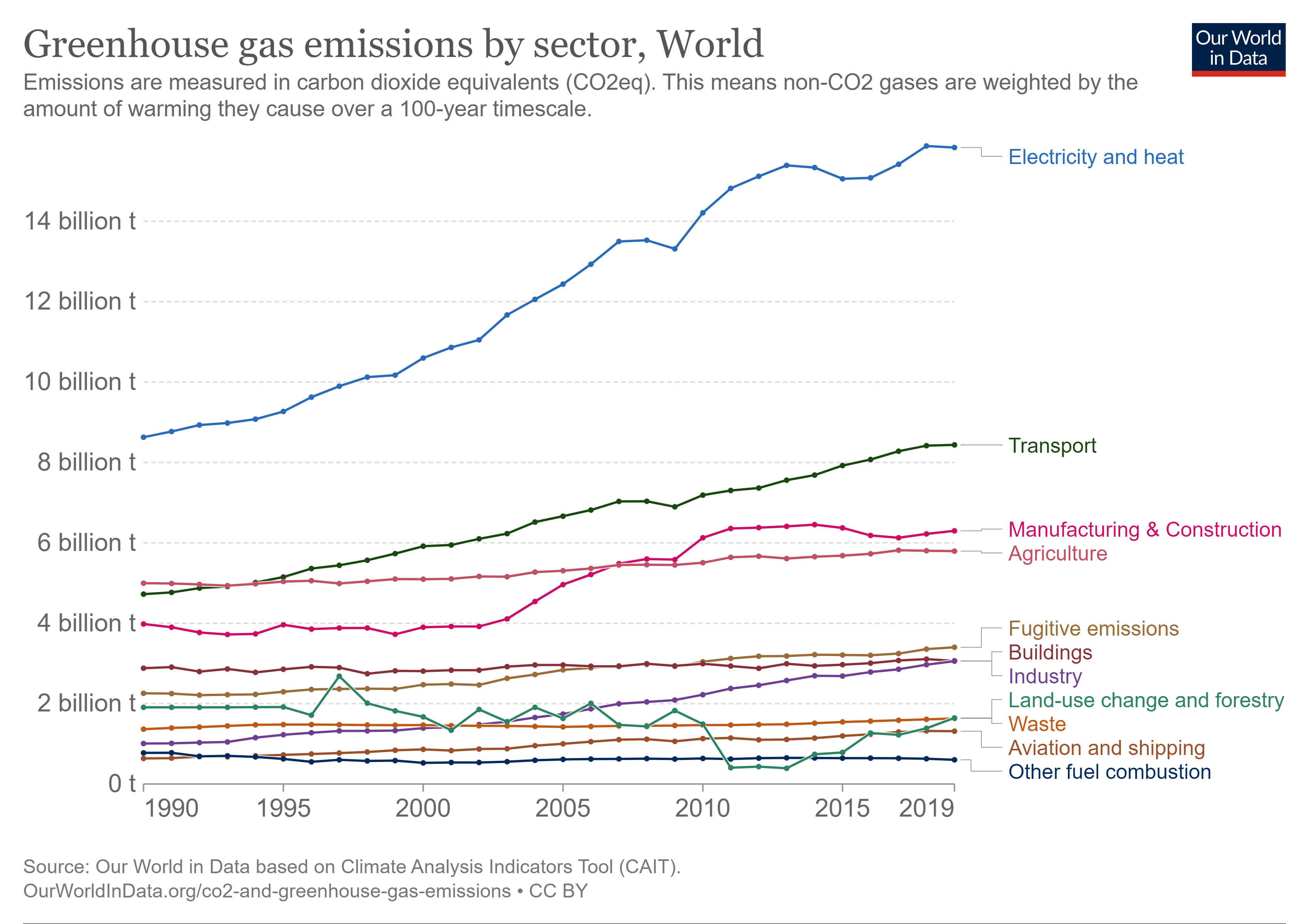
Figure 4.15: World GHG By Sector (1990 – 2019). Source: https://ourworldindata.org/emissions-by-sector
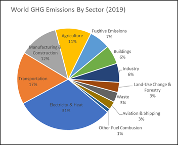
Figure 4.16: World GHGs By Sector in 2019
The carbon dioxide emissions coefficients for transportation fuels are summarized in Figure 4.17 from the EIA. Gasoline, diesel, and jet fuel are similar in emissions which makes sense since they are all refined fuels from petroleum that are combusted in ICEs. Finished Motor Gasoline (FMG) emits slightly less carbon dioxide than regular Motor Gasoline in this dataset since the former generally has a few percent of bioethanol blended in to reduce other air emissions. The bioethanol fraction of this fuel (5 – 15%) is considered to have no GHG emissions as discussed previously since the carbon dioxide emitted during combustion is assumed to be absorbed back into the following year’s biomass crop to make new biofuel.
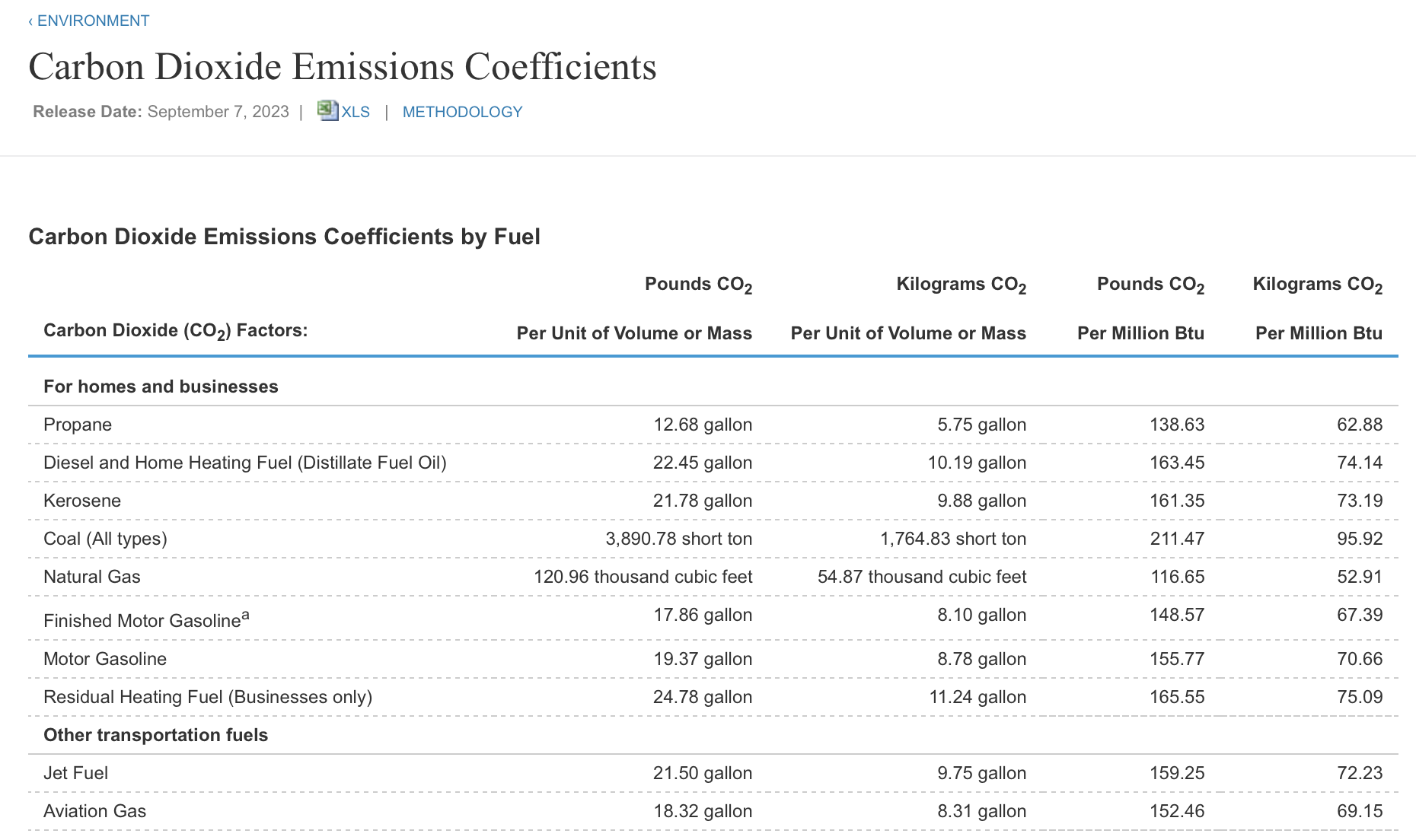
Figure 4.17: Transportation Fuel Carbon Dioxide Coefficients, Source: https://www.eia.gov/environment/emissions/co2_vol_mass.php
A quick calculation can provide an estimate of the carbon dioxide emissions from driving a vehicle. The emissions value of finished motor gasoline in Figure 5 4.17 is 17.86 lbs CO2 per gallon and an average US vehicle has a 15-gallon fuel tank. This means that each tankful of gasoline emits (15 gallon/tank) x (17.9 lb CO2/gallon) = 269 lb CO2/tank. Scaling this up to the amount of fuel used in a year from annual mileage and specific vehicle fuel economy quickly provides and estimate for annual carbon dioxide emissions from driving. Since fuel economy is inversely proportional to fuel use, doubling the fuel economy with a more efficient ICE or hybrid vehicle will drop the emissions by 50%.
4.1.6.1 Comparing transit options using passenger miles
We all have different options to choose, from taking a bus in the morning to driving car or riding a bike. We also know that a car has much lower emissions than a large bus. But the difference is that the bus typically has a lot more people on it! With emissions, we may compare the emissions per mile driven. To compare amongst transit options, we can take into account the number of people moved:
\[\begin{equation} \frac{Emissions}{passenger \times mile}=\frac{emissions}{miles \times capacity \times loadfactor} \tag{4.8} \end{equation}\]
Example: According to the latest data from the US Department of Transportation Federal Highway Administration, the average miles traveled by cars in the US is 13,500 miles per year. Assume the average fuel economy is 25 mpg. Estimate the amount of CO2 emissions in tons/yr for an average US vehicle.
4.1.6.2 Scaling up
Individual vehicle choices can be scaled to the entire country by considering the total number of vehicles on the road in the US. The value in 2022 was approximately 290 million vehicles from state vehicle registration data.
If we revisit the Carbon Wedge diagram in Figure 4.18, there are 4 different transportation options to save 1 wedge (a billion tons) of carbon per year. With the examples given in this chapter, you should be able to verify these number for a wedge by making a few simple assumptions for each. This will be left as an exercise for you.
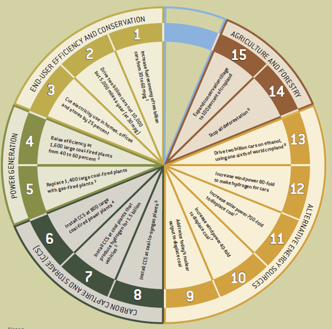
Figure 4.18: Carbon Wedge Diagram
Example: Carbon Wedges for Transportation: Show that each of these statements are true through an estimation analysis.
1/ Transport Efficiency - A wedge of emissions savings would be achieved if the fuel efficiency of all the cars projected for 2050 (2 billion) were doubled from 30 mpg to 60 mpg.
2/ Transport Conservation - A wedge would be achieved if the number of miles traveled by the world’s cars (2 billion) were cut by 50%.
3/ Hydrogen Fuels - Increase wind power by 80X to make hydrogen for vehicles
4/ Biofuels - One wedge of biofuels savings would require increasing today’s ethanol production by about 30 times, but also making it sustainable in terms of land, water use, and food trade-offs.
4.1.6.3 Human Health Impacts - it’s not all about saving our world
Emissions for vehicles have environmental and health impacts beyond carbon dioxide. The high temperatures of fuel combustion in air lead to the formation of nitrogen oxide (NO2) and sulfur dioxide (SO2) when sulfur is present in fuel. You may recall seeing “low-sulfur diesel” listed on fuel pumps which provides diesel fuel in which sulfur content has been limited to reduce SO2 emissions that can lead to acid rain. A small portion of the fuel is also not fully combusted leading to small carbon particles know as particulate matter. These particles are further designated as PM10 or PM2.5 for particles less than 10 microns and 2.5 microns, respectively. The particle size is critical since smaller particles in the air that we breathe can lodge more deeply in our lungs leading to additional health issues.
The Clean Air Act Amendments of 1970 established National Ambient Air Quality Standards (NAAQS) for criteria air pollutants (CAPs). Criteria air pollutants are air pollutants which have proven human health impacts and for which acceptable levels of exposure can be determined and for which an ambient air quality standard has been set. These include ozone, carbon monoxide, nitrogen dioxide, sulfur dioxide, lead, and PM10 and PM2.5. Increasing regulation has reduced these values in recent decades as shown in Figure 4.19.
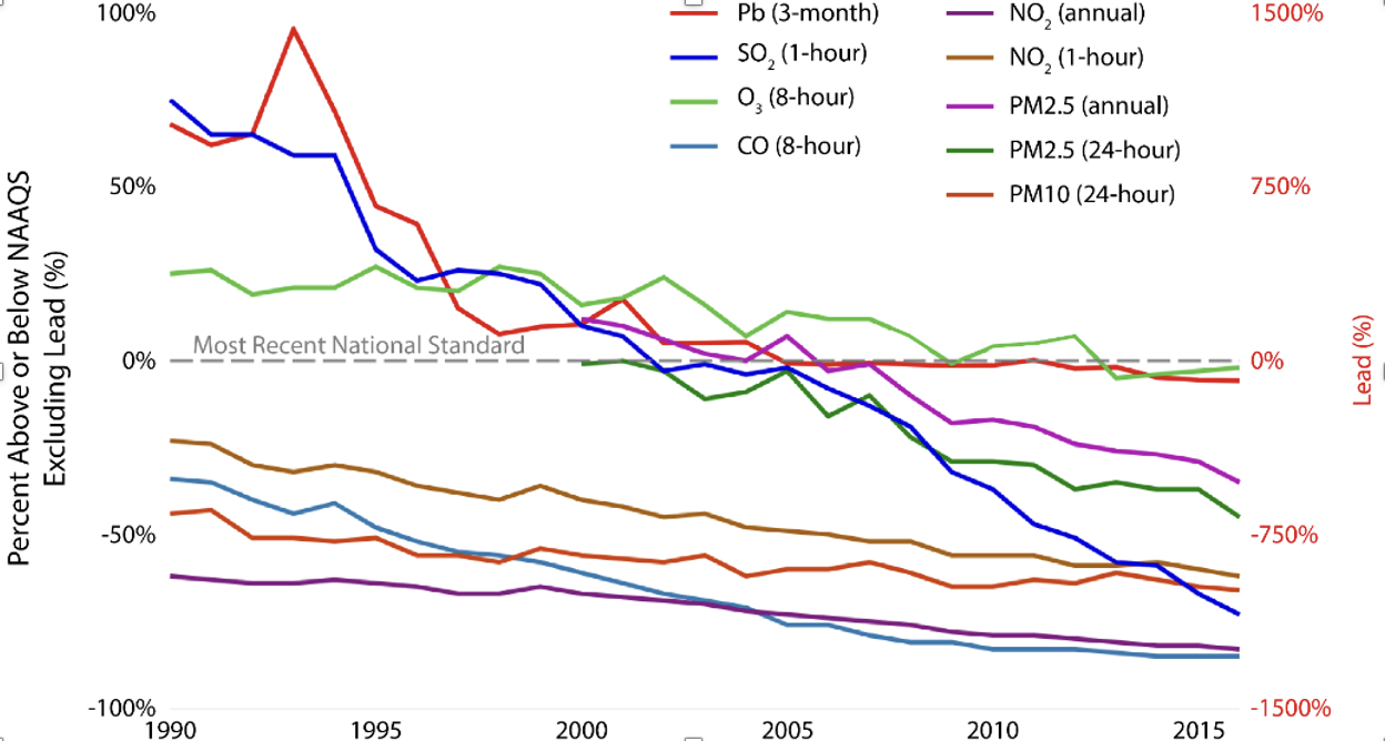
Figure 4.19: Carbon Wedge Diagram
Catalytic converters are a technology added to vehicles to meet the requirements of the Clean Air Act. A schematic of this device is shwon in Figure 4.20. Engine exhaust gases from a vehicle tailpipe pass through the catalytic converter and are converted to less harmful substances.
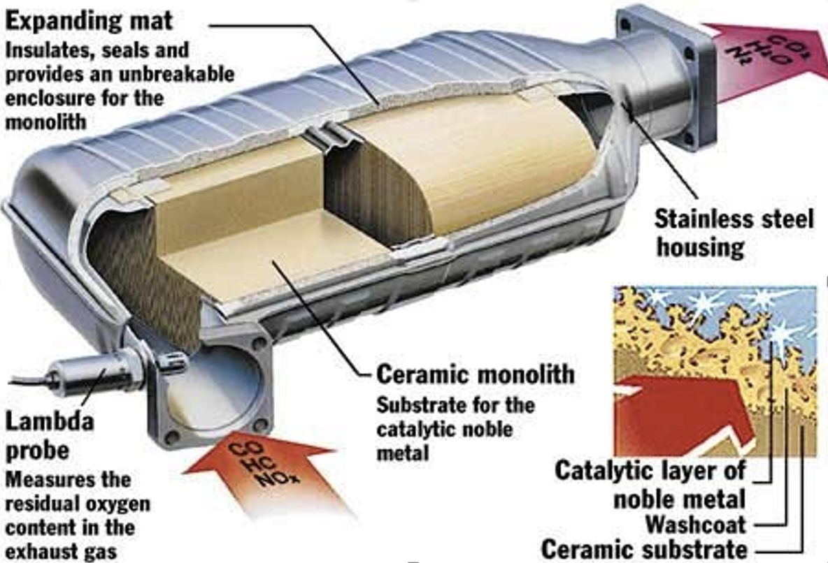
Figure 4.20: Diagram of the catalytic converter.
The two-way catalytic converter developed around 1975 uses platinum and palladium catalysts to oxidize carbon monoxide (CO) and unburnt hydrocarbon and particulates (HxCy) to carbon dioxide and water via the chemical reactions below. Note that the use of a catalytic converter does reduce the CAPs which are regulated, but creates more CO2. This amount of CO2 is small compared to that generated from the combustion of the fuel itself.
\[\begin{equation} 2CO + O_{2}\rightarrow 2CO{2} \tag{4.9} \end{equation}\]
\[\begin{equation} 4H_{x}C_{y} + 5O_{2} \rightarrow 2xH_{2}O + 4yCO_{2} \tag{4.10} \end{equation}\]
\[\begin{equation} 2C_{6}H_{6} + 15O_{2} \rightarrow 6H_{2}O + 12CO_{2} \tag{4.11} \end{equation}\]
The three-way catalytic converter developed around 1983 uses rhodium catalysts to oxidize and reduce nitrogen monoxide (NO) and nitrogen dioxide (NO2) to nitrogen and oxygen via the chemical reactions below:
\[\begin{equation} 2NO \rightarrow N_{2} + O_{2} \tag{4.12} \end{equation}\]
\[\begin{equation} 2NO_{2} \rightarrow N_{2} + 2O_{2} \tag{4.12} \end{equation}\]
Precious metal catalysts are required for these chemical reactions which take place at high temperatures. Approximately 1 – 2 grams per car and 10 – 15 grams per truck of precious metal per vehicle are required and this has led to some stealing of catalytic converters, especially from trucks at rest stops, for resale of these valuable metals.
Beyond emissions, driving an automobile is inherently dangerous for pedestrians, cyclists, and other forms of micromobility options. This recent [NYT op-ed]{https://www.nytimes.com/2023/10/21/opinion/pedestrians-cars-trucks-suvs-death.html?smid=nytcore-ios-share&referringSource=articleShare} shows the increase in pedestrian and bicycle fatalities across the US. There are likely some of us in this classroom who know someone whose lost their life in such a manner. Here in Blaclsburg, I can recall two deaths over the last couple of years. In September 2022, John Thomassona junior at Virginia Tech, died after being struck by a car on South Main Street. In 2015, Mark Slough, a junior in Aerospace Engineering, died after being struck by a car on Tom’s Creek Road. While I did not know either of these students, I have an understanding of the impact to their families. In 1998, my brother’n’law Dennis Scott died after being struck by a car while walking on a sidewalk. These are just 3 examples of individuals who had a lifetime ahead of them. What can you do while driving? Slow down - death rates become near certain if a pedestrian is hit above 30mph. Put down you phone - and use the 2 to 4 second rule when following another car or bicycle (WV has a resource that’s relevant to all of us to be better drivers). Know the rules - drivers can only pass a car when they have visibility and greater than 3 feet of room between their car and the cyclist. The article also describes how the shape of a car affects the outcome of the person struck, as well as the weight of the car that impacts the stopping distance.
-
What can you do on campus and across town to improve everyone’s safety?
-
Should town put up speed cameras? Data shows that it slows cars down, which in turn keeps our community safer. Maybe more people would bicycle if they felt safer?
4.1.6.4 EVs are not emission free
An important distinction in the discussion of air pollution and vehicles is that of point-sources vs. nonpoint-sources. This topic will come up again in the Water chapter. Point-sources are a single location of a pollutant emission. An example would be a large emissions stack on a power plant or steel mill. Nonpoint sources, in the context of transportation, are emissions sources which move like the exhaust of any type of vehicle. This is important because point-source, though they typically have higher emissions, are easier to retrofit with technology to either reduce or capture the emissions. In the design and decision-making, the location of point sources can be away from large population centers like cities which is why utility power plants are generally in more rural areas. Vehicles, on the other hand, are moving and while the catalytic converter can help with some emissions, it does not handle all of them. Addressing nonpoint sources means that each vehicle must be considered rather than a single solution.
EVs are not emission free unless the electricity that charges the battery comes from renewable energy sources. However, the emissions now occur at power plants away from large population centers which reduces some health impacts like lung and cardiovascular issues from ozone, smog, and carbon monoxide. New technologies to capture and sequester carbon are also easier from a power plant rather than at the car level. Conventional ICE vehicles have GHG and CAP emissions which occur where they are driven so large cities with significant traffic create health impacts from their emissions as well as contribute GHGs to climate change.
4.1.6.5 Transportation Economics
Upfront costs for electric vehicles is higher than for conventional ICE vehicles, but as we have seen from the exercises, electricity (fuel) costs are cheaper in almost all situations in the US if charging at home.
Unlike solar panels and wind turbines, vehicles don’t generate energy so they have no payback time on their own. There are additional upfront costs compared to conventional vehicles, plus fuel and maintenance costs over time. The fuel and maintenance costs are generally lower, especially as batteries become more reliable and cheaper.
If you need to buy a new or used vehicle, you can have a relative payback time compared to similar vehicle with lower fuel economy. Due to higher fuel efficiencies and lower fuel costs, the ongoing fuel savings for one vehicle compared to another could offset the initial cost difference over time. So, we can use a similar simple payback time as shown in the equation, but it compares the initial cost differences to savings (fuel, maintenance, etc) differences. This equation only makes sense if the more expensive vehicle, noted as 1 in the equation, has fuel savings. If there are rebates involved, those could reduce the cost difference in the numerator.
\[\begin{equation} PaybackTime = \frac{\Delta Cost_{dollars}}{\Delta S_{savings per time}}=\frac{InitialCost_{1}-InitialCost_{2}}{FuelCost_{2}-FuelCost_{1}} \tag{4.13} \end{equation}\]
For vehicles, it sometimes is more useful to caculate payback in terms of miles driven rather than years since these can vary significantly depending on the amount of driving done, for example a short work commute vs. a long distance sales representative. In this case:
\[\begin{equation} PaybackDistance = \frac{\Delta Cost_{dollars}}{\Delta S_{savings per mile}}=\frac{InitialCost_{1}-InitialCost_{2}}{\frac{FuelCost_{2}}{mile}-\frac{FuelCost_{1}}{mile}} \tag{4.14} \end{equation}\]
Fuel prices are compiled in the DOE Alternative Fuel Price Report shown in Figure 4.21. You can see that fuels are commodities so their costs are variable over time and difficult to predict. This is different than electricity costs which generally trend steadily upward and do not have the variability of commodities.
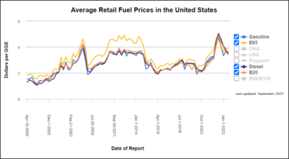
Figure 4.21: Fuel Price Comparison over Time. Source: Alternative Fuel Price Report, July 2023. https://afdc.energy.gov/fuels/prices.html
4.2 Building Systems
Buildings are a huge consumer of energy and contributor to environmental impacts. Like transportation, buildings affect everyone and there are many opportunities for improvements. As seen in Figure 4.22, buildings consumer roughly 50% of raw materials and 40% of energy consumption. They also produce 30% of waste and carbon dioxide emissions.
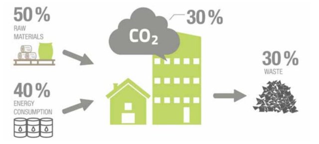
Figure 4.22: Energy and Material Consumption in Buildings, Source: https://www.armacell.us/blog/post/quality-characteristics-of-technical-insulation-materials/
According to a recent study by the National Renewable Energy Laboratory (NREL), buildings consume approximately 40% of total US energy use including 75% of all electricity use. This represents approximately 35% of the nation’s carbon emissions. These values are slightly different since the scope boundaries for the building sector are not always defined to cover the same processed and materials. According to Architecture 2030 and the more detailed data in Figure 4.23, the built environment is responsible for about 42% of annual global CO2 emissions.
Building operations are responsible for approximately 27% of those emissions, while the embodied carbon of just four building and infrastructure materials – cement, iron, steel, and aluminum – are responsible for an additional 15% annually.
In addition to these current numbers, many building experts are suggesting that up to 75% of all of the infrastructure that will exist in 2050 has yet to be built. This means there is a tremendous opportunity to reduce embodied energy and emissions in building materials since the expectation is that operational energy and emissions from electricity use will decrease significantly in coming years with more renewable energy sources.
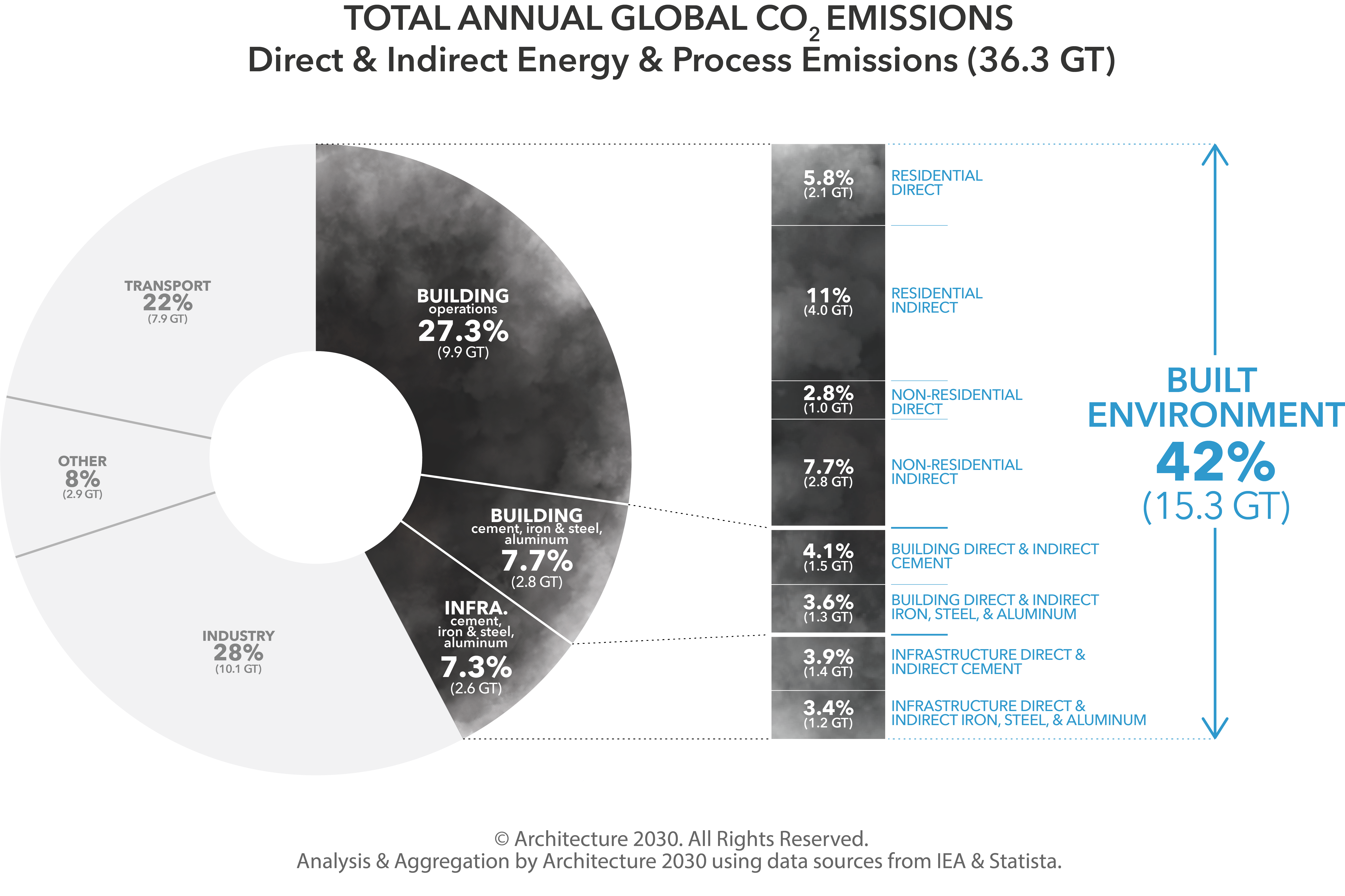
Figure 4.23: Building Emissions Worldwide, Source: https://architecture2030.org/why-the-built-environment/
One major driver for increased energy and emissions in buildings is that fact that house sizes have increased 20% since the 1970s and houses occupied by only one person have increased from 9% in 1950 to 29% in 2022 (see here). Figure 4.24 shows the distribution of energy use in residential housing. It is noted that Space Heating dominates with 33% of energy use in houses and, when combined with space cooling (air conditioning) and water heater, these 3 categories account for almost 60% of energy use.
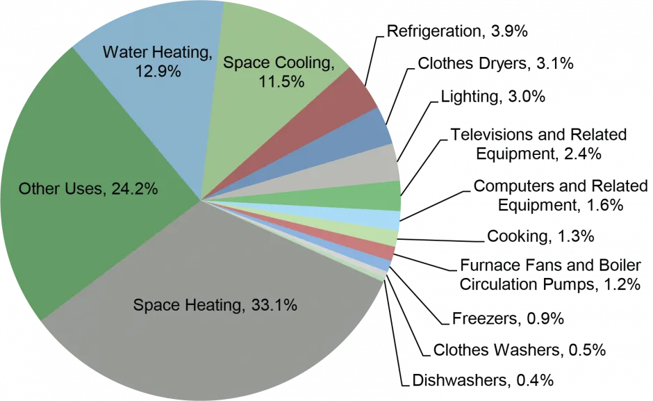
Figure 4.24: US Residential Energy Consumption by End Use 2022, Source: EIA, Annual Energy Outlook 2023
A similar distribution of energy data is seen in Commercial Buildings (Figure 4.25) with Space Heating as the predominant use, however, lighting and ventilation are larger components of commercial buildings compared to residential buildings.
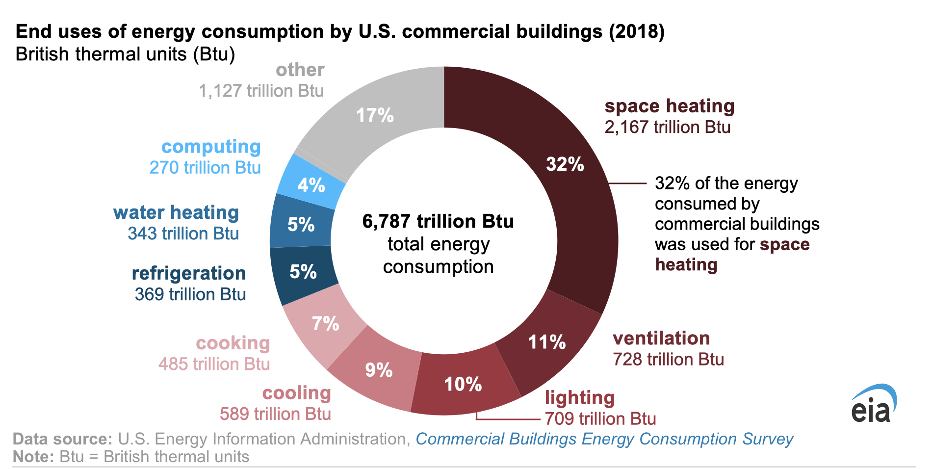
Figure 4.25: US Commercial Energy Consumption by End Use 2022 Source: https://www.eia.gov/todayinenergy/detail.php?id=55199
Air leakage out of a building or air infiltration into a building are main reasons for energy inefficiency in a building. Air leaks in or out of gaps in houses at doors, windows, electrical penetrations, vents, etc. Many small leaks in a house mean that a typical house has the equivalent of one or two standard windows open all the time. Because these leaks are small and not so noticeable, they make a house feel uncomfortable and drafty and lose energy due to heat escaping in the winter or heat entering the house in the summer.
4.2.1 Weatherization
Weatherization is a general term covering all of the practices and technology for protecting a building and its interior from the outside weather. It includes modifying a building to reduce energy consumption and optimize energy efficiency, especially by reducing air infiltration. Health and safety improvements are co-benefits to some weatherization practices, and other significant safety hazards are also considered in these programs. In the US, there are federal and state programs to help lower economic citizens since the energy and health costs of poorly constructed buildings places a higher burden on these people. Weatherization is typically done at the residential house level, but the concepts apply to apartment complexes, offices, and other buildings though it’s more complicated as the buildings get larger and often not owned by a single entity.
A home energy audit is typically the starting point for weatherization since it identifies the major issues for houses and buildings. The blower door test, described in more detail later, is the primary diagnostic test to identify the total infiltration (leaking) of air in a building as well as the individual locations which are not sealed and therefore leaking air in or out of a building. In most seasons, air leaking in or out of a building is carrying heat (or cooling) and therefore reducing the efficiency of HVAC systems which must heat (cool) the replacement air. The most common locations and contribution for leaks are shown in Figure 4.26 include vents, attic ducts, crawl spaces, doors and windows, electrical and plumbing entry points, and chimneys.
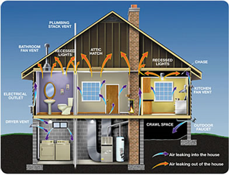
Figure 4.26: Illustration of common air leaks.
Insulation can reduce infiltration to some degree, but does not typically seal leaks unless it is spray foam insulation. The sealing of holes and gaps with caulk, foam, and tape are the primary technique to lower infiltration. Insufficient, missing, or poorly installed insulation can also be found using a blower door test and infrared camera which can see hot and cold areas in a house. Adding insulation to attics, crawlspaces, walls, and around ducts and water heaters is also typically part of weatherization since it reduces energy usage beyond just sealing to minimize infiltration.
The safety considerations for weatherization primarily look at the venting of combustion equipment including furnaces as water heaters. These must be vented properly to prevent the combustion chemicals from entering the living space where they can cause health problems and death. Vents can be installed incorrectly or have leaks in the ducts between the equipment and the outlet. Carbon monoxide is the most critical chemical to vent since it is odorless and can cause death. In addition to checking the venting, houses with any combustion equipment should have carbon monoxide detectors which are checked quarterly to ensure that they are working.
Weatherization has been evolving beyond the items listed above to include new technology to improve total house efficiency. The includes more efficient heat pump HVAC systems and water heaters, programmable and smart thermostats, air filters and monitoring systems and energy efficient appliances. Many of these options are included in the Inflation Reduction Act (IRA) tax credits for homeowners which are detailed at the end of this chapter.
Air leaking out carries energy in the form of heat energy with it – heat in the winter and cooling energy in the summer. This energy per unit time is shown the equation below where qinf is the heat loss due to infiltration (Btu/hr), /rho is density of air (0.075 lb/ft3), Cp is specific heat of air (0.24 Btu/lb F), V is volume of house (ft3), and /delta T is the temperature difference from inside to outside. The number of normal air changes per hour, n, is the number of times all of the air in the house is exchanged with outdoor air in an hour which indicates the “leakiness” of a house. US Buildings codes require homes at least 0.35 air changes of outdoor air per hour to maintain the quality of the indoor air.
\[\begin{equation} q_{inf}=\rho C_{p} n V \Delta T \tag{4.15} \end{equation}\]
Energy infiltration rates are used most often over an entire year or a summer or winter season. This means that the average difference in temperature (/delta) for inside and outside air is needed across a year in a given location. To get this information, heating degree-days (HDD) and cooling degree-days (CDD) are a simple measure of the temperature variation for a given location. They are often based on an assumed 65 °F balance point temperature for a house. For outside temperatures higher than this balance point, the house must be cooled and for temperatures below this, the house must be heated. Note that this definition leads to some small errors since many people set their thermostats at slightly higher temperature than 65 /deg F .
A blower door test is a method to estimate overall leakage from a house. In this test, the house is closed up completely and the blower door is set up in a door as shown schematically in Figure 4.27. Air is pulled out of the house by a fan until a given pressure difference (inside vs. outside) is reached. The airflow (cfm) required to hold this this pressure, often 50 Pa, is measured.
The air exchange rate for a blower door test is given by the following equation and is the artificial air exchange rate when the house is depressurized in order to make the measurement easier and faster. Direct measurement of n, the average air exchange rate is very difficult and typically not done.
\[\begin{equation} ACH50=\frac{CFM50\times 60\frac{min}{hr}}{V} \tag{4.16} \end{equation}\]
where ACH50 – air changes at 50 Pa/hr, CFM50 is in ft3/min, and V = ft3 per air change.
The annual average air exchange rate at normal pressure, n, can be estimated from the equation below which has been determined empirically over many years and thousands of house blower door tests.
\[\begin{equation} n=\frac{CFM50}{20} \tag{4.17} \end{equation}\]
where n = air changes per hour.
Note that from years of energy audit data, it is also known that another good rule-of-thumb metric for visualization for house leakage is that the cumulative size of all leaks in a house in square inches is given by the blower Door test air flow rate at 50 Pa in cubic feet per minute (CFM50) divided by 10.
\[\begin{equation} A=\frac{CFM50}{10} \tag{4.18} \end{equation}\]
where A = area of all leaks in square inches.
A tight, well-sealed new home usually achieves 0.5 air changes per hour or less. A reasonably tight older home typically has an air change rate of about 1 per hour. A somewhat loose older home with no storm windows and caulk missing in spots has an air change rate of about 2. A fairly loose, drafty house with no caulk or weather-stripping and entrances used might have an air change rate as high as 4 or higher. As the air exchanges get higher, the energy efficiency goes down and heating/cooling costs increase. Comfort also goes down as high air exchanges lead to humid air entering in the summer and cold drafts entering in the winter.
On the other hand, if a house is sealed too tight, it may have too low air exchange to move “stale” air out of a house. CO2 may be higher than optimal as fresh air is not being exchanged to replace CO2 being exhaled by the occupants. Ventilation is also important to remove virus and other indoor air pollutants so there is a balance between healthy ventilation and energy efficiency.
ASHRAE, formerly called the American Society of Heating, Refrigerating and Air-Conditioning Engineers, recommends in Standard 62.2-2016, “Ventilation and Acceptable Indoor Air Quality in Residential Buildings”, that homes receive at least 0.35 air changes per hour to provide IAQ that is acceptable to human occupants and that minimizes adverse health effects. There are additional mechanical ventilation system with heat exchange that can be added to tightly sealed houses to meet both ventilation and energy efficiency optimums.
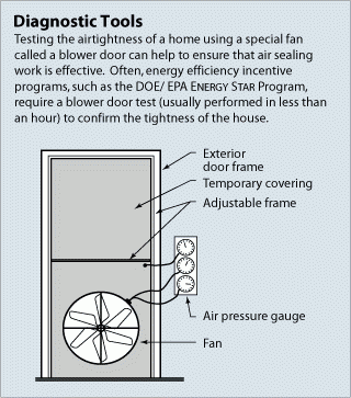
Figure 4.27: Blower door test setup. Source: https://www.energy.gov/energysaver/blower-door-tests
Commercial buildings have more occupants and higher air exchange rates. Figure 4.28 provide ventilation rates for different uses. As occupants, conversation levels and other factors change, higher ventilation rates are recommended. The Harvard Healthy Buildings Program has an online calculator for design recommendations under different conditions.

Figure 4.28: Recommended Ventilation Rates for Different Building Uses. Source: https://smartairfilters.com/en/blog/ashrae-air-changes-per-hour-office-residential/
We have read earlier in this chapter about electrification of the Transportation System and similar efforts are underway in both Residential and Commercial Building stock. As an example of the potential of energy consumption reduction, NREL modeled the residential housing stock of Ohio and found that we could reduce its total energy use by 68% by implementing basic insulation and air sealing improvements and switching to high-efficiency electric appliances and heat pumps. The details of the baseline and electrified house model are shown in Figure 4.29.
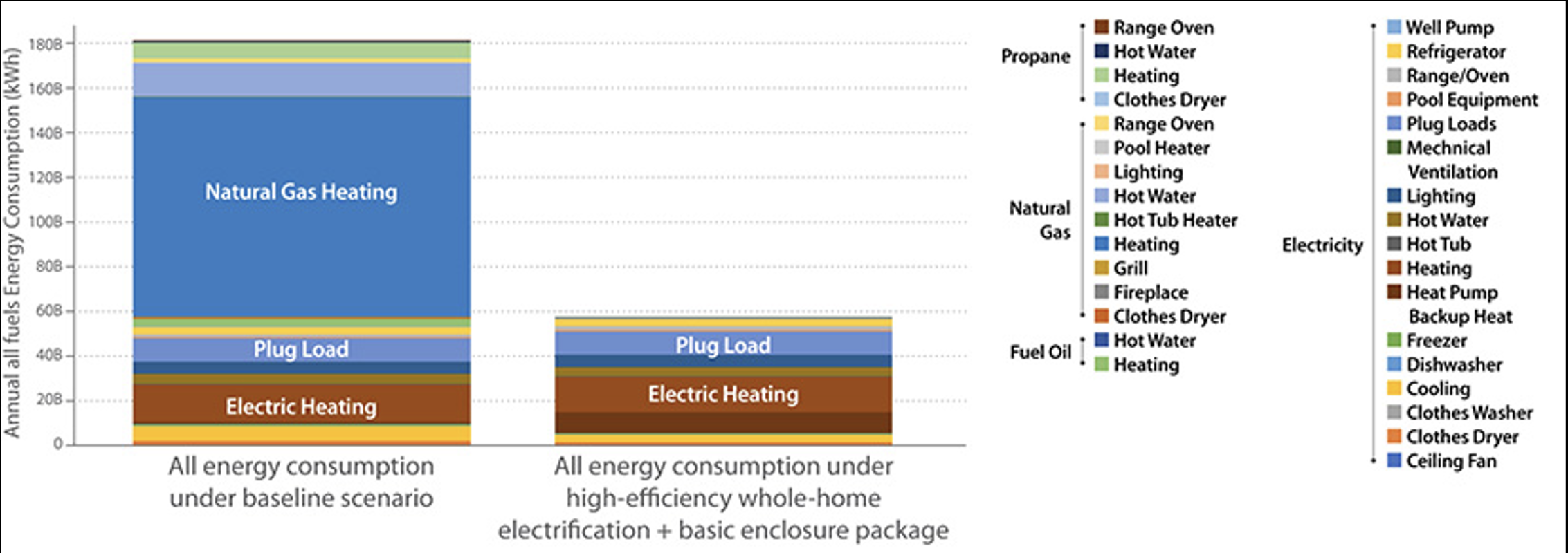
Figure 4.29: Baseline and Electrified Energy Efficient Housing Model for Ohio. Source: https://www.nrel.gov/news/features/2023/nrel-researchers-reveal-how-buildings-across-the-united-states-do-and-could-use-energy.html
A key technology for electrification of buildings is the heat pump. These systems work to heat and cool a space by transferring heat. A heat pump is reversible so that is can cool in the summer and heat in the winter. In the summer, the heat pump works like a refrigerator for air conditioning. Using a gas refrigerant, a compressor and electrical energy, heat is removed from the refrigerator interior and transferred out. There are key thermodynamics for this heat transfer using a refrigerant, but these are more advanced concepts that will not be covered. If you’ve ever been working on the backside of a refrigerator, you can feel the heat that is transferred out to cool the inside. This is same mechanism by which the heat pump works to cool a house in the summer. As seen in Figure 4.30, the heat pump has an indoor and outdoor coil for heat transfer and a compressor and reversible valve typically outside. Refrigerant flows between in the indoor and outdoor coils. In the summer, heat is absorbed from the indoor air to cool it and released by the outdoor coil to the air. Ducts in the house blow the cooled air through the house.
The system is reversed in the winter and called a heat pump instead of air conditioning. Using a refrigerator again as an example, if you pushed your refrigerator to an outside door in your house and turned it around, the heat from the back of the refrigerator would be transferring into your house with the cold side on the outside. In your house heat pump during the winter, the valve is reversed and the refrigerant flows the opposite way between the coils. Heat is now absorbed from the outdoor air, even though the air is cold, and this heat is released by the indoor coil to heat the air in the house.
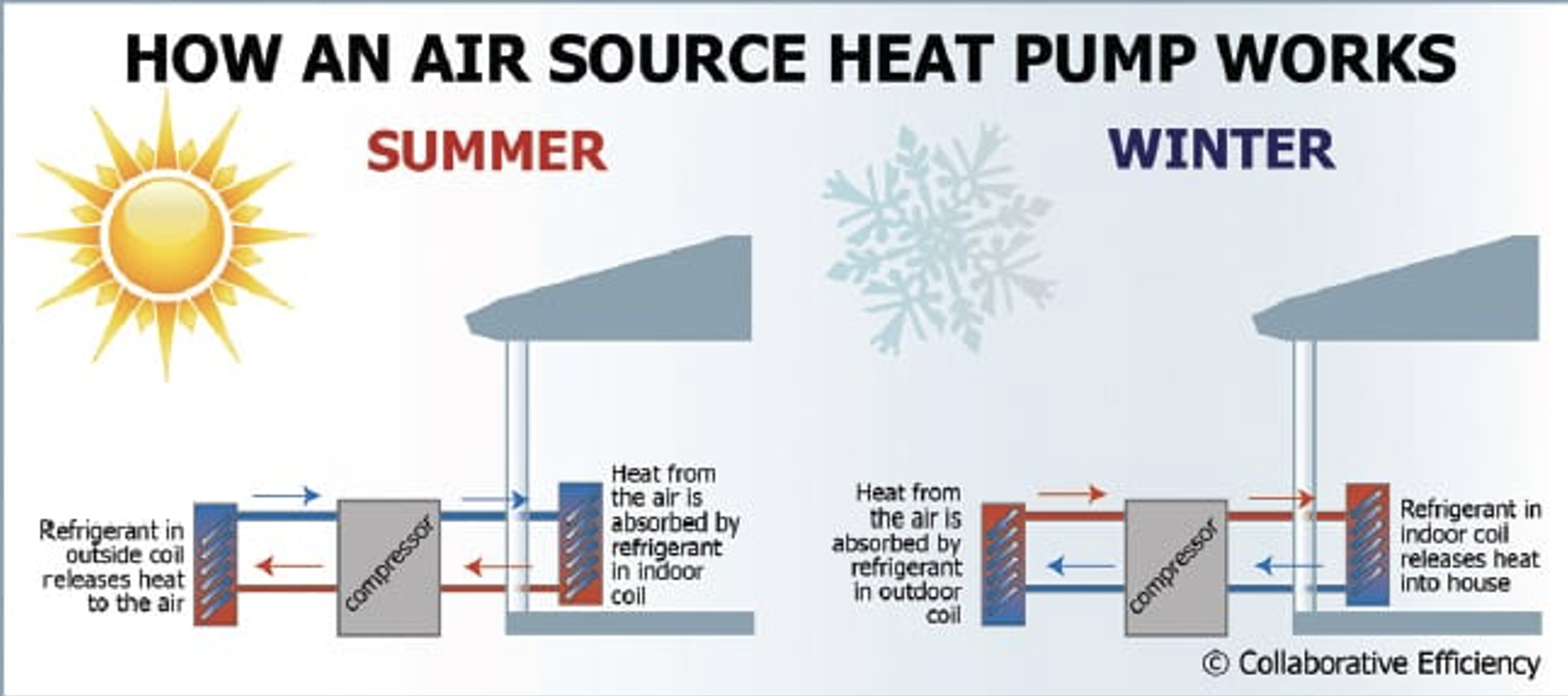
Figure 4.30: Air Source Heat Pump Schematic. Source https://www.tnmagazine.org/benefits-air-source-heat-pumps/
The heat pump is limited by the thermal properties of the refrigerant and the inside and outside temperatures. For an air source heat pump which is most common and depicted in figure 4.30, the temperature is exchanged with the outside air. In summer, the inside temperature of 65 – 70 F is obtained by using the electrical energy in the compressor to transfer this heat to the outside temperature of 80 – 100 F, depending on the location. As the outside temperature increases, the energy required to transfer this heat is higher. In the winter, to maintain a temperature of 65 – 70 F, the heat is transferred insider from the 30 – 60 F outdoor air in most places in the US. Similarly, as the outside temperature gets colder, it’s harder to transfer this heat indoors.
For more efficiency, a ground-source heat pump can be used to take advantage of the ground temperatures rather than air. Once you get more than a few feet underground, the ground temperature is stable around 50 F. A ground-source heat pump, as shown in Figure 4.31, has a cooling loop underground instead of an outdoor air coil. The indoor part of the heat pump system is more or less the same. Now, in the summer the inside temperature of 65 – 70 F is obtained by heat exchange with the 50 F ground which is 30 – 50 F cooler than the outdoor air. In the winter, the heat is transferred insider from the 50 F ground which is generally typically warmer than the outdoor air in most places in the winter. Because of these more favorable temperature differences, the ground-source heat pump is significantly more efficient. Ground-source heat pumps are typically more expensive in terms of installation cost since the ground loop is more difficult and expensive to install underground and has more materials.
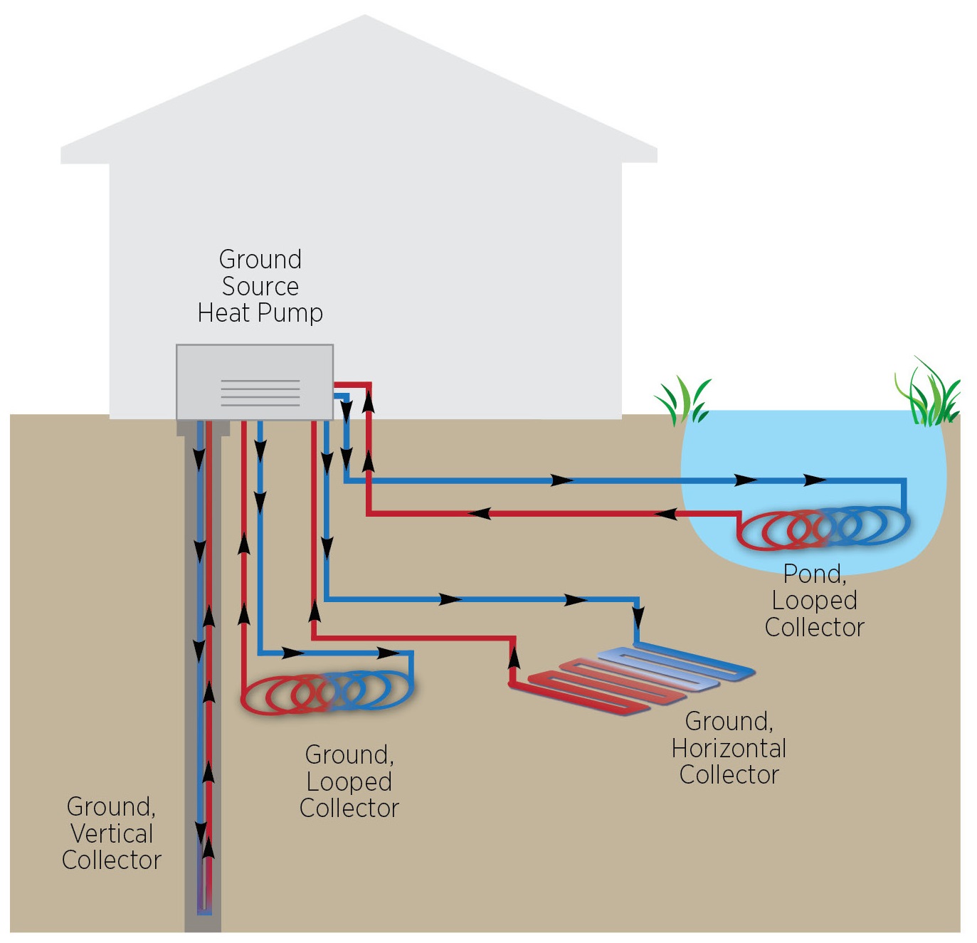
Figure 4.31: Ground Source Heat Pump Schematic. Source https://basc.pnnl.gov/resource-guides/geothermal-heat-pumps
Heat pumps are characterized generally by a unitless metric known as the Coefficient of Performance (COP) which is show in the equation below. This is the instantaneous efficiency of the system and it changes depending on the inside and outside temperatures. As just described, heat pumps are least efficient when the temperature difference T is high, that is, both on the hottest summer days and coldest winter days. It is generally more useful to estimate the average heat pump performance over the entire heating or cooling season since the temperature difference changes with the season.
\[\begin{equation} COP=\frac{Heat Energy Output}{Electrical Energy Input} \tag{4.19} \end{equation}\]
The COP is typically greater than 1.0 or 100% since energy (heat) is extracted from the surroundings and transferred indoors. It is like the system has an efficiency greater than 100%, but this is not strictly true, rather the energy from the outside air or ground is considered “free” energy which adds to the efficiency.
Figure 4.32 shows several cases to compare the efficiency of a traditional furnace with a heat pump. Starting with 100 units of heat in all cases, the natural gas furnace loses 4% of the gas in distribution and then another 5% efficiency loss in the furnace itself. Overall, this is a 91% efficient system which seems quite good. For the heat pumps, the COP equation is used instead of the standard efficiency equation, but input and output heat is still considered in the system. Heat pumps are driven by electricity, so in both the air-source and geothermal (ground-source) cases, 67% of the input fuel energy is lost with a 33% efficient power plant. For the air-source heat pump, 51 units of heat are transferred into the house based on the COP giving an overall efficiency of 81%. For the geothermal heat pump, 90 units of heat are transferred into the house based on the COP giving an overall efficiency of 120%. This shows how the heat pump can be very efficient. Note that the 95% condensing furnace is a high-end system which is not common due to cost. Most gas furnaces have lower efficiency. Electric strip-type heaters common in lower end housing have efficiencies close to 100%, but in that case the power plant is still 33% efficient so the overall efficiency would be 33%.
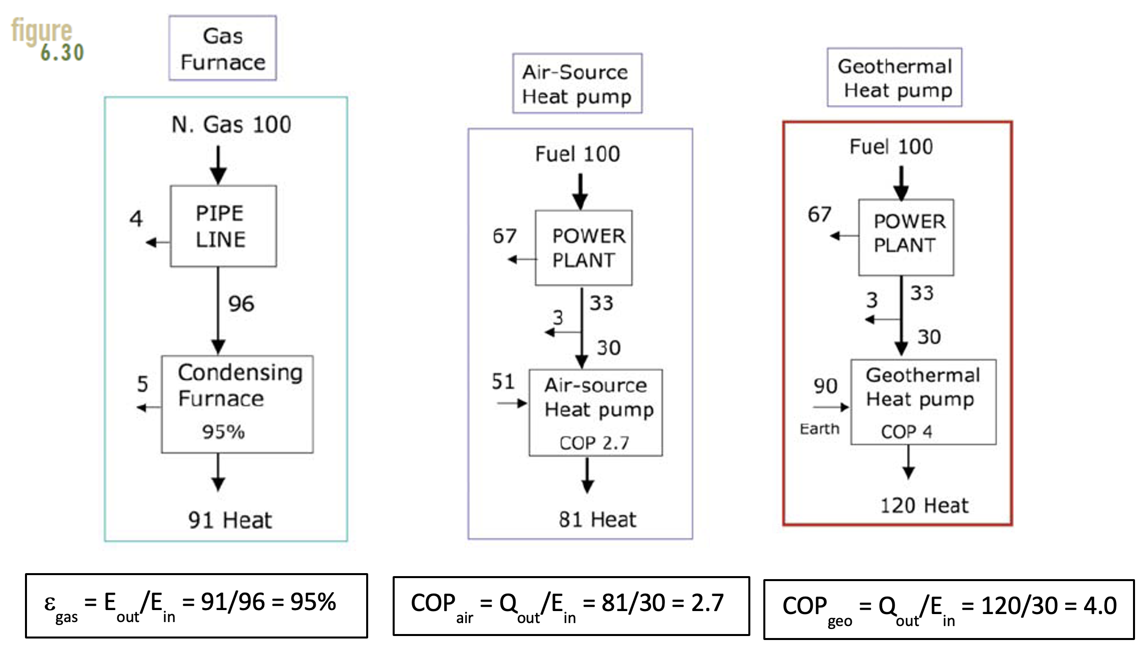
Figure 4.32: Furnace and Heat Pump Efficiency/COP Comparison. Source Energy for Sustainability, J. Randolph and G. Masterson
Because heat pumps work as both a heater and air conditioner, there are two separate efficiency metrics often used in place of the COP. As an air conditioner, the performance is given by the Seasonal Energy Efficiency Ratio (SEER), which tells us the average heat energy (Btu) that can be extracted from the house per watt-hour of input electricity over the cooling season (summer). The heat energy (Btu) in this equation is equal to the cool air which is leaking out of the house and must be replaced to keep the house cool. From the SEER, you can calculate the input electricity needed for this cooling using the specific energy units.
\[\begin{equation} SEER=\frac{Cooling BTU}{Electrical Energy Input} \tag{4.19} \end{equation}\]
where SEER = BTU/Wh and Cooling = BTU.
As a heater, heat pumps are rated by their Heating Season Performance Factor (HSPF), which is the average seasonal heat energy delivered to the house (Btu) divided by the electrical input (Wh). Similarly, the heat energy (Btu) in this equation is equal to the hot air which is leaking out of the house and must be replaced to maintain the temperature. From the HSPF, you can calculate the input electricity needed for heating.
\[\begin{equation} HSPF=\frac{Heating BTU}{Electrical Energy Input} \tag{4.20} \end{equation}\]
where HSPF = BTU/Wh and Heating = BTU.
Figure 4.33 shows a typical energy sticker for a heat pump system. The SEER and HSPF allow the contractor and homeowner to understand the efficiency of the system relative to other systems. Higher numbers are better for both of these metrics since more energy (heat or cooling) is obtained for less electricity. The SEER and the HSPF technically have the units in the equations shown above, but often these units are not shown in the energy labels and are assumed.
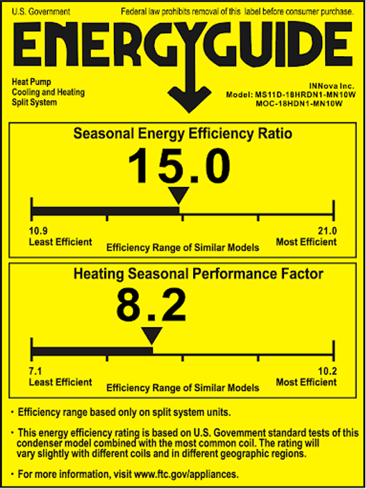
Figure 4.33: Ground Source Heat Pump Schematic
Heat pump standard have been rising by federal law over the past few decades. The current US Energy Star standards for heating pumps are SEER ≥ 15.0 in the southern US, SEER ≥ 14.0 in the northern US, and an HSPF ≥ 8.8 as seen in Figure 4.34.
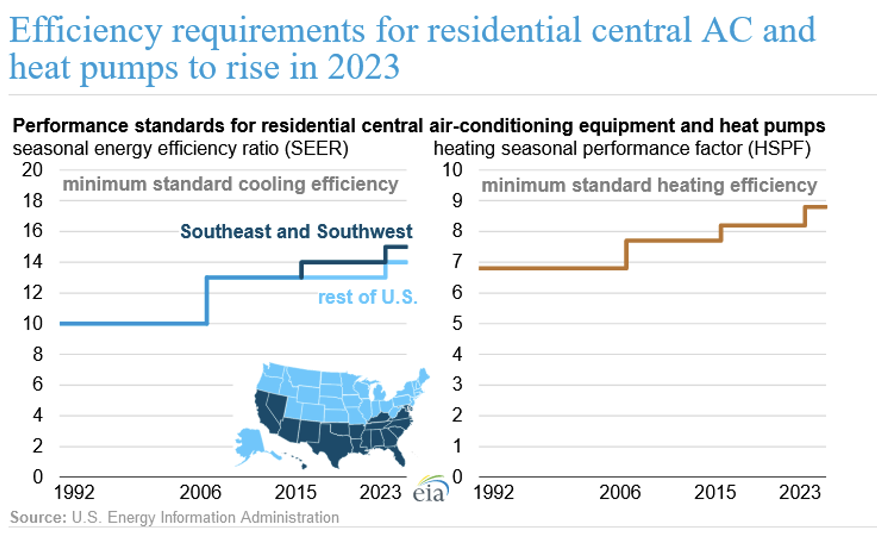
Figure 4.34: Efficiency requriments for residential AC and heat pumps
Heat Pump Example - Consider the following Blacksburg residential home characteristics: − Home heating input requirement of 50 million Btu/year to heat the house − Electric resistance heating system with 95% efficiency − Electricity for resistance heating from a fossil fuel power plant that is 35% efficient − Assume no electricity transmission losses for simplicity
- How much primary energy (Btu/yr) is required as an input to the power plant to provide the electricity needed to heat the house?
- What is the overall efficiency of the entire energy system from the primary power plant fuel to home heating energy?
Now consider replacing the resistance heater above with a heat pump system that has a coefficient of performance (COP) of 4 in the winter:
- How much primary energy (Btu) is required as an input to the power plant to run this heat pump to provide the same heating requirement for the home?
- For the heat pump, calculate the Heating Season Performance Factor (HSPF). Be careful with the units which are specified for this metric.
- How much energy (million Btu/yr) is this heat pump getting from the outside air to meet the input heating requirement for the home?
Remember that these equations are approximations as they only account for infiltration (leakage). Heat is also lost (gained) by a house from conduction through walls/insulation and windows and by radiation. A more accurate energy model of a house would consider all of these heat losses.
The PassivHous concept is a design framework started in Germany which combines many of these concepts and technologies.
4.2.2 Air Quality and Health
According to the EPA, Americans spend as much as 90% of their time indoors, and surprisingly to most people, concentrations of some pollutants can be 2 to 5 times higher than typical outdoor concentrations. Furthermore, according to the World Health Organization (WHO), up to 30% of buildings worldwide suffer from poor indoor air quality (IAQ). In the US alone, it is estimated that hundreds of millions of dollars are spent on health care related to poor IAQ.
Worldwide, around 2.4 billion people still cook using solid fuels (such as wood, crop waste, charcoal, coal and dung) and kerosene in open fires and inefficient stoves.
There are a number of non-profit companies around the world developing low-cost and efficient cook stoves to dramatically improves indoor air quality and health in these areas.
Cooking emissions are in the news in the developed world as well in recent years due to a spotlight on research showing the negative effects of gas stove emissions. Stoves that burn natural gas or propane are very popular and have been pushed by natural gas companies looking to increase demand for their product. If a new house is built with a gas stove, this also makes it more likely for the contractor to use natural gas for heating and water heating since it is cheaper and the infrastructure has already been added for the stove.
Like any type of combustion, a gas stove is generating combustion emissions including carbon dioxide, carbon monoxide, nitrogen oxides and other chemicals. Exhaust fans are recommended for gas stoves, and required in some areas, but they are not always used or may not effectively remove the harmful emissions. Much research over the past few decades has shown correlations to lung and breathing issues including asthma, especially for children.
Gas stoves, and other natural gas appliances, also leak methane into the environment causing a small chance of explosion and climate change impacts due to the high global warming potential of methane. According to a recent study in the Washington Post, and other studies, natural gas leakage in cities due to the distribution network as well as gas stoves and other equipment is much higher than previous estimates. Measurements and analysis in Boston estimated 2.5 % of all gas delivered to the city leaked which is equivalent to the GHG emissions of approximately 250,000 cars driving for a year.
Another issue with air quality in houses is radon. Radon is a radioactive gas that forms from the natural decay of uranium that is found in many soils. Some regions have a geology and soil character that make them more prone to high radon emission levels. Radon diffuses up through the ground and into homes through cracks and other penetrations in the foundation. Poor ventilation causes the concentration of radon to increase in houses where it is generally highest in basements. Radon is one of the leading causes of lung cancer. Radon testing and mitigation is required when buying and selling a home. When the radon level is measured at 4 pCi/L (picocuries per liter) or more, action is required in order to sell a home. Typically, radon is addresses by drilling through the foundation and installing a collection system and pump which vents the radon-containing air out above your roof into the atmosphere where it is diluted to safe levels.
Carbon monoxide is a less common but more acute health hazard in houses. Carbon monoxide ends up in houses mainly due to malfunctioning combustion equipment or ventilation. Natural gas furnaces and hot water heaters produce low levels of carbon dioxide which is designed to be evacuated by the system ducts and ventilation. Where there is a problem, carbon monoxide can accumulate in houses where it has no color or smell and can cause death. Another source of carbon monoxide is the exhaust of a car. In some cold weather climates, people might warm up their car in their garage which is a very bad idea. Depending on the style of construction, attached garages are sometimes at higher pressure than the house and exhaust gases like carbon monoxide can inadvertently be pulled into a house. Carbon monoxide detectors, either stand-alone or as part of a fire detector, are critical for houses with combustion equipment and can save lives in the event of a system malfunction.
4.2.3 Inflation Reduction Act
There are a number of economic implications for design changes and renovations for residential and commercial buildings. Many of the technology and design changes discussed in this chapter save money due to higher efficiency and/or reduction in energy costs. All of these, including heat pumps, better insulation, more energy efficient windows, and others have additional upfront costs but energy savings over time which means that a payback time could be calculated. Since most individual and businesses do not have unlimited funds, it is useful to calculate these payback times and the scale of environmental impact or energy reduction in order to sort them for decision-making.
The federal Inflation Reduction Act (IRA) provides tax credit for a number of these items similar to the 30% tax credit that we saw in the previous chapter for solar panels. Beginning January 1, 2023 for home improvements to a primary owned home, up to 30% of the following items can be claimed. There is also a maximum credit that can be claimed annually which often is less than 30% for some times.
$150 for a home energy audit
$250 for an energy efficient exterior door up to $500 (two doors)
$600 for energy efficient windows
$600 for central air conditioners,
$600 for central air conditioners, water heaters (natural gas, propane, oil), and furnaces (natural gas, propane, and oil) if they meet the highest level of efficiency standards
$1200 total for energy property costs
In addition to these limits, there is a higher limit for some equipment.
$2000 for qualified heat pumps and biomass stoves/boilers
$2000 for qualified heat pump water heaters
Currently, there is no lifetime credit limit meaning that these maximum amounts could be claimed every year for eligible home improvements until 2033. There are also technical requirements on efficiency or documentation required to obtain these credits. Like the case for solar panels, these tax credits are reductions on the upfront costs even though they are not paid back until the following tax year. As such, they reduce the upfront cost in the numerator of the simple payback time calculations.
4.3 Community and Infrastructure
Community = a group of people living in the same place, definition from Oxford languages
The Third Place
Ray Oldenburg was an author and socioligst who thought about how communities function. He wrote a book called The Great Good Place in 1989. In the book, he described the third place - outside of the home and work - where people gather informally, places in communities where peolple interact without having to a barrier to entry.
Check out this video if you want to learn more. The video describes characteristics of third places (from a European perspective) which are transferable to life here in the US, whether you are live where the community gathering spot is a gas station at the local crossroads, the McDonalds in your home town, or Mill Mountain Coffee here in Blacksburg (you can often find Dr. Scott in Mill Mountain after class on Thursday - say hello!).
“This (referring to third places) is a sign we can do things differently. As people, we can be different and interact differently. That we can put aside our fears and scary stories that we carry along with us in our backpacks, even if for just a moment, and can meet on an entirely different level, again as human beings.” - interview from video
Within Green Engineering, we often focus on the technological solutions that will meet an objective, such as reducing waste or reducing carbon emissions. While single solutions will make some headway in meeting objectives, designing and planning at the community or regional level is fundamental to rethink today’s approaches and proactively plan for tomorrow’s that include all aspects of the Triple Bottom Line.
Let’s go back to the mid 1930’s. At that time, there were no highways connecting towns and cities across the US. After WWII, the US invested heavily in building highways, going from 0 miles pre 1940 to over 70,000 km in 1985. These investments changed the way we travel and where Americans lived, with new communities built along highway corridors. The car and the road infrastructure offered us the ability to travel where and when we wanted to. Our nations’s GDP grew significantly, and the U.S. prospered.
Because there’s only so much tax dollars to support infrastructure, the growth of the Federal Highway system and roads throughout towns and cities came at a price - reduction in other forms of transit. Furthermore, highways through cities selectively disenfranchised whole communities - damage that is just beginning to be rectified today. Roadways were designed to efficiently move people quickly from point A to point B - and design revolved around LOS, or level of service. The LOS metric is traditionally meant to do the following: ‘represent a traveler’s perception of the quality of service provided by an individual intersection or roadway segment, as measured by the standard of free-flowing automobile traffic’, per US DOT.
The result is largely what we see today across the US. Roads are meant for car-drivers, where other forms of mobility (bikes, walkers) are largely an afterthought. Most places we build today don’t consider bikes or walkers. For example, imagine you had to pick up some house supplies at Target and wanted to grab some more dog food at Petco. If you were to take a bus from Squires, it’ll take at least 30 minutes and the frequency is less than 1 bus per hour. If you biked, it’ll take you about 40 minutes along the Huckelberry. If you drove, only about 12-18 minutes depending on traffic. If you opt to drive, which would be the majority, you have another decision to make: where would you park (Figure 4.35? One summer day a while back, I chose to park in the middle thinking I’d bridge the gap and would walk to both stores. I was with my 4-year old, and he was in good spirits as we embarked on the adventure. After said ‘adventure’, we were hot and I was relieved to have made it back to our car in one piece (we were beeped at while navigating the car-centric parking lot - you’d think I would have anticipated this).

Figure 4.35: A google image of the parking lot between Target and Petco, Christiansburg, Virginia.
Let’s do another thought experiment: when you think of places across the world that you want to visit, what comes to mind? Many of us may choose a place with outdoor opportunities, including hiking, fishing, hunting, or biking. Others of us may choose a place that once you get there, you can find a place to grab a coffee, see some music, and grab a dinner without having to drive a car. What does this have to do with sustainability? Well, the vast majority of people live in urban areas, and as our population increases, we need to think of growth sustainable and equitable strategies that reduce vehicle miles traveled.
The characteristics of a vibrant town or city most often include the abilty to get to recreate, socialize, buy food and supplies, and sleep within a 15-minute walk, bike, or transit. The concept is not about minimizing travel time, but rather maximizing access to options that people regularly travel to. A recent NPR piece highlighted the 15-minute concept as part of one climate change solution.
Why walking or biking? Research has shown that social interactions have positive health outcomes, as well as the exercise benefits. Cities like Decatur, Georgia, have been recognized as a walk friendly community. Their Gold-Level award was centered on walkability throughout the core and rethinking zoning pertaining to parking minimums, and the actively promote walking through programs. In early January of 2020, I dropped my daughter off for a study-abroad program in Decatur. Evidence of the town’s committment to biking and walking was evident - there was active construction of some of some cycleopaths that were part of their transportation masterplan. Take a quick look at this plan, and you’ll see evidence of a participatory process to rethink what the community desired to be.
Here in Blacksburg, transportation is a major part of the town’s comprehensive development plan, of which pedestrian access, bikability, and public transit are highlighted. Rather than design for LOS, our town’s comprehensive plan explicitly prioritizes safety (Vision Zero), includes a metric called LTS (Level of Stress (LTS) for cyclists which ranges from 1 to 4, where 1 = low stress and 4 = invloves close interaction between cyclist and fast cars). The town of Blacksburg and Virginia Tech have worked together to transport students to campus via the Blacksburg Transit, or affectionately known as the BT. The joint venture with the new Bus Station on VT’s campus is meant to improve BT’s service and reduce congestion on roads. The question towns and cities across the US face is summed up by Daniel Herriges from the Strong Towns initiative:
“Mobility is how far you can go in a given amount of time. Accessibility is how much you can get to in that time.”
“Ideally the journey itself should be pleasurable, and at a minimum must feel safe.”
What is the safe system approach? It means not focusing solely on moving drivers quickly from place to place, but rather prioritizing safety for pedestrians and bicyclists (and scooters, etc.). Research has shown that when people feel safer and see the other benefits of walking or biking, they are more apt to engage in these activities and rethink how they get around. The approach is not advocating to abandonthe car. Places that prioritize walkable communities are generally places were people desire to live.
Four elements are central to the Safe System approach:
-
Safe speeds are core to a Safe System approach and are the first layer of protection. People who are hit at slower speeds face less injury, whereas higher speeds are more deadly.
-
Safe streets consider all people who use the streets and are designed to be forgiving of mistakes and human frailty.
*Safe vehicles are designed and maintained to prevent crashes and protect all road users – including those outside of the vehicles.
*Safe people using the road are alert, unimpaired, and comply with road rules. They take steps to improve their safety and the safety of others.
Unfortunately, pedestrian deaths and injuries have increased 37% from 2021 to 2022,(Virginia). There is a lot of work to do.
Peter Furth developed the concept of Level of Stress for bikability. Here are the categories:
-
LTS 1: Strong separation from all except low speed, low volume traffic. Simple crossings. Suitable for children.
-
LTS 2: Except in low speed / low volume traffic situations, cyclists have their own place to ride that keeps them from having to interact with traffic except at formal crossings. Physical separation from higher speed and multilane traffic. Crossings that are easy for an adult to negotiate. Corresponds to design criteria for Dutch bicycle route facilities. A level of traffic stress that most adults can tolerate, particularly those sometimes classified as “interested but concerned.”
-
LTS 3: Involves interaction with moderate speed or multilane traffic, or close proximity to higher speed traffic. A level of traffic stress acceptable to those classified as “enthused and confident.”
-
LTS 4: Involves interaction with higher speed traffic or close proximity to high speed traffic. A level of stress acceptable only to those classified as “strong and fearless.”
If you were to choose to bike to campus, what would be the maximum LTS that you would encounter along the route? For me, my bike commute is a LTS level 3. While all of the roads I encounter are posted at 25-mph, the actual speeds are probably more like 35-mph and there are no separated bike lanes.
Has Blacksburg made progress? I would say overall yes - Blacksburg Transit has been quite a success since inception in the early 1980’s. College avenue is different today than it was less than 10-years ago when there was 2-way traffic (figure 4.36.
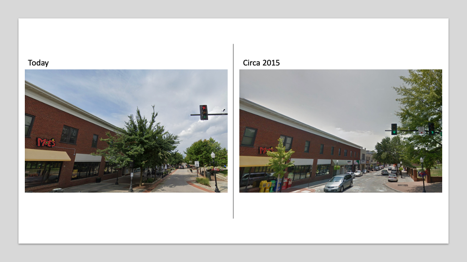
Figure 4.36: A google image of College Avenue in 2015 and in 2019.
Policy changes and changes in perceived safety were important determinants of increased cycling during the pandemic—more so than individual or community characteristics. During COVID, the town closed off lower Draper Road and repurposed the street for people, not cars. Today, there’s a plan that’s underway to permanently close the street. It took Covid for communities to rethink public space. Permanent changes are now being discussed and made in cities and towns across the US, where some smaller streets were dedicated to bikes and parking spaces were reallocated for tables. A recent study examining cycling during the pandemic found that perceived safety was imporant for recreational cyclists, including policies that limiting residential streets to local car traffic and increasing the e-bike accessibility.
While Covid jump started the rethinking process in many communities, long-term planning has generally been used to vision and create a desired result. Urban planners often focus on terms called Smart Growth or Transportation Oriented Design, which the SmartTowns and 15-minute cities have come from. Let’s look at one example that may be familiar to some of us - Arlington, Virginia. During WWII, Arlington grew exponentially as part of the war effort. The Pentagon was built in 1943, and today has over 28,000 people that work there. In the early 1950’s, the Federal Highway system was being developed, and by the early 1960’s malls became the place to shop. All of these rapid changes were on the minds of planners and leaders in Arlington, where they initiated a smart-growth process and Transit Centered Design. These folks were shaped by WWII:
“We were a can do society, you know what I mean? We had just been in WWII. We had beat the Germans and Japanese. And gosh, we could do anything. And we did.”
Thomas Richards, Arlington County Board Member 1961-1968; 1975
These leaders envisioned a metro service that went right through Arlington (what the orange line is today, figure 4.37 to revitalize the town (much of the content below is a summary from an Arlington video). They envisioned an underground metro line where each station was a hub of activity - places to work, eat, and sleep. They also wanted to keep the residential neighboods intact, based on the citizen’s feedback. While there were some people that did not want to see any change, overall the project was supported. The initial route was to put the orange line in the middle of 66 all the way into DC, and the original route of 66 was going to go right through Roslyn - this was all about doing it to lower costs. While Arlington didn’t want any part of 66, the local leaders realized they need to compromise - support 66 and in return get an underground line through Arlington. The orange line also ended up with an additional from the funds that were meant for a Georgetown Station, which at the time was blocked by local residents. Development around each station was designed to:
- do a lot near the station, within a 1/4 mile.
- walkability
- mixed uses (activity all day long and into the evening) (residential, commercial)
- Also want a variety with quiet residential neighborhoods beyond the 1/4 mile.
During the decade of construction, businesses suffered. But the concience decision to identify smart growth and not scatted growth resulted in the area today - and now so attractive that it’s now too expensive for many to live there. The success in the orange line corridor was attributed to “uniting public purpose and private property - a former Arlington board member”.
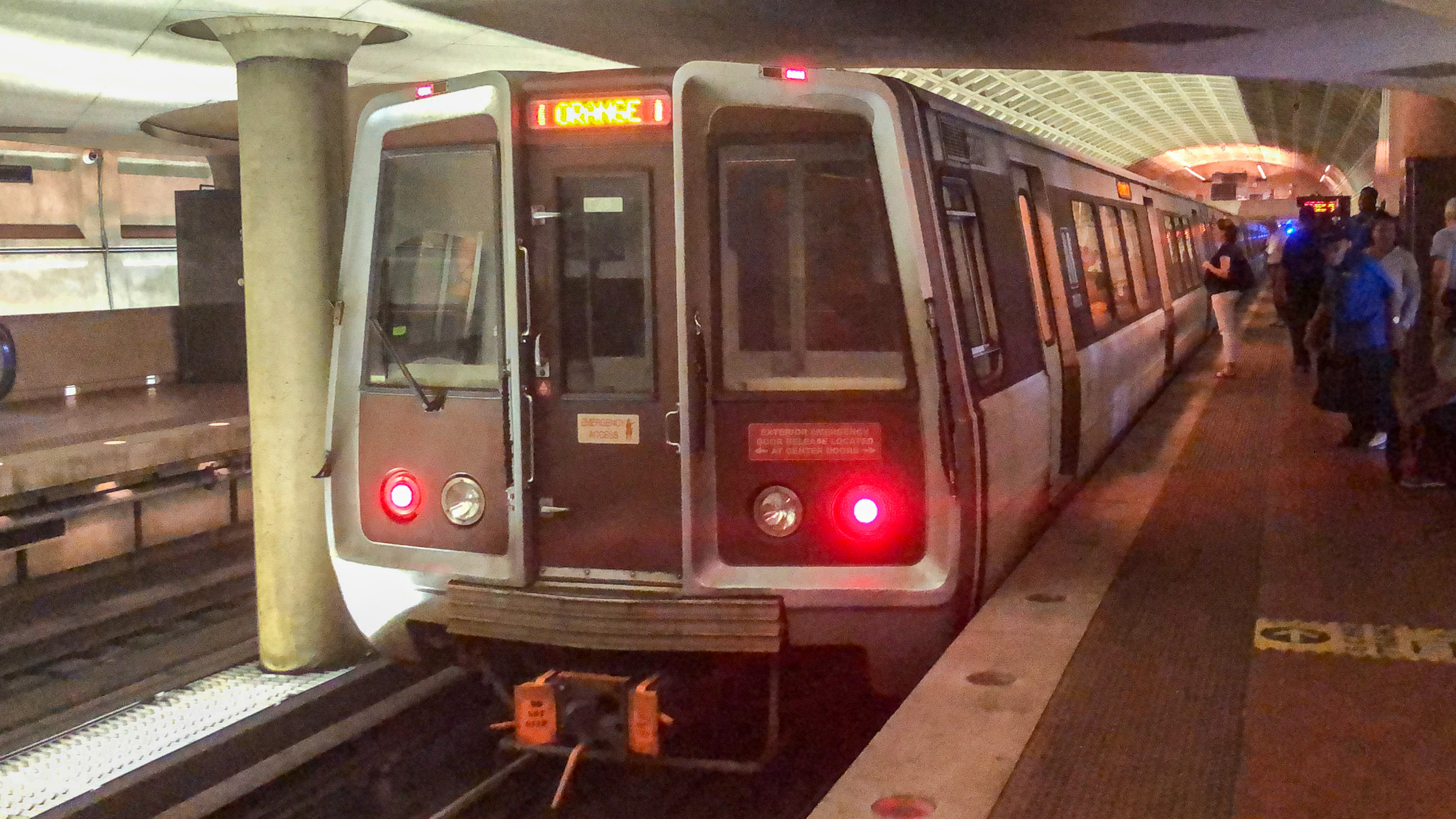
Figure 4.37: The orange line today that goes right through Arlington, Virginia.
Today, their’s acknowledgment that everything wasn’t perfect. There’s realization that the corridor has displaced residents, and the corridor is lacking in affordable housing. Approaches to increase affordable housing have come with comprosmises - if a developer is given the right to build taller, then they can provide a profer (build affordable housing or contribute to a fund). Now other regions in the county are in the process of long-term planning, with a goal to focus on improving livability and the economic vitality while not displacing people.
Beyond Arlington, another example in DC of connecting communities is the 11th Street Bridge Project. Lastly, Virginia Tech’s new Innovation campus is expected to change the footprint south of the Reagan Airport - the metro station was even renamed to Potomac Yard/VT metrorail!